EazyDiner Elite
A credit card you can find, apply for and use without leaving EazyDiner, an app for booking restaurant tables. I designed it alone in two days in 2024, then redesigned it in 2026.
- Role
- Product designer, working alone, on a two-day design assignment
- When
- 28–29 June 2024, redesigned in September 2026
- Platform
- Android app, designed in Figma and FigJam
- Deliverables
- User flow, 16 wireframes, a 24-screen prototype, 6 redesigned screens
The brief
I designed a credit card journey inside EazyDiner, from the first offer to managing the card, using IndusInd in the screens.
The card, as the brief set it
- Dining
- 20%off every meal at partner restaurants
- Every month
- 1free Premium Dine
- Everywhere else
- 3%cashback, plus some travel perks
- Joining fee
- ₹5,000
- Renewal
- ₹2,500a year, waived if you spend ₹2 lakh in the year
Diners who already save with EazyDiner could save more with its credit card, but getting one means a long bank form, an identity check and days of waiting. All of it had to work inside an app people open to book a table.
The 2024 form18 fields, all typed, in three steps
Six hard parts
What makes a bank application inside a restaurant app harder than a normal sign-up.
- A long form: a PAN (India’s tax ID), income, employer and address.
- An identity check, KYC, by video call or a home visit. 56% of Indians have given up on a bank application over slow ID checks.
- Days of waiting while the bank decides and a courier brings the card.
- ₹5,000 to join and ₹2,500 a year, which nobody should find out halfway through the form.
- EazyDiner’s look on a bank’s questions, and it still has to feel safe.
- Years of PINs, limits and bills once the card arrives.
How it works today
EazyDiner already has a card with IndusInd. Four of the six steps to get it happen on the bank’s website.
Design process
Five stages over two rounds: two days in June 2024, and a redesign in September 2026.
- 1
Understand
June 2024 · research in 2026
The brief, the problem, the market, and the cards EazyDiner would compete with.
- 2
Define
28 June 2024
Who the card is for, and the rules every screen had to follow.
- 3
Structure
28 June 2024
The whole flow in FigJam, then greyscale screens.
- 4
Design
28–29 June 2024
Android screens in EazyDiner’s colours, linked into a prototype.
- 5
Redesign
September 2026
Back to the file two years later: what was missing, a design system, and six screens rebuilt.
Market research
With no research time in 2024, I worked from assumptions. In 2026 I reviewed RBI data, industry reports and surveys on credit and dining.
Credit cards in India
10.8 cr
in December 2024, up from 5.5 crore five years earlier. A crore is ten million.
Co-branded
1 in 3
new credit cards is co-branded with a company like Swiggy or Amazon.
In use
70%
of co-branded cards are active, against 50% of other cards.
Eating out
3.7
restaurant meals a month per person in 40 Indian cities, plus 4.2 orders in.
Co-branded cards in India, by category, FY24
Dining is a small corner
Three in four co-branded cards are tied to online shopping. Dining and entertainment is 3 to 5%.
Zomato’s card with RBL Bank closed in May 2023, which leaves Swiggy’s with HDFC Bank as the big food-app card.
Competitor analysis
I compared the EazyDiner IndusInd, Swiggy HDFC and Amazon Pay ICICI cards using their public pages. An empty circle means the card’s page doesn’t mention it.
| Card | Where you apply | Identity check | Savings shown first | Digital card first | Joining fee |
|---|---|---|---|---|---|
| EazyDiner IndusInd25% off bills paid in EazyDiner | Bank website | Video KYC | ₹2,999 | ||
| Swiggy HDFC Bank5–10% back on Swiggy | Swiggy app | You type spends | ₹500–1,000 | ||
| Amazon Pay ICICIRewards on Amazon | Amazon app | Video KYC | None | ||
| EazyDiner EliteThis design · 20% off dining | EazyDiner app | Video or visit | 2026 | 2026 | ₹5,000 |
Finding 1
Apply where people already are
Swiggy and Amazon take the application in their own apps. EazyDiner’s real card sends people to the bank’s website, so mine stays in the app.
Finding 2
Show the saving in rupees
Swiggy turns spending into a yearly saving, but you type the numbers in. EazyDiner already knows how often you book, so the 2026 landing page works it out.
Finding 3
Cover the wait
Amazon gives a digital card straight after video KYC. None of the three pages says what you see while the plastic is on its way; the 2026 tracker does.
Target user
I couldn’t interview users in 2024, so Vivek is based on assumptions: a salaried Prime member in his late twenties who eats out most weekends.
Vivek Verma
27 · New Delhi
- Work
- Salaried, in IT
- Income
- ₹45,000 a month
- Eats out
- Most weekends
- On EazyDiner
- Books tables, and pays for Prime
Wants
- A bigger discount on something he already spends on
- To apply without leaving the app he already uses
Put off by
- Long bank forms
- Hidden fees
- Not knowing when his card will arrive
Checked in 2026
The reports offered some support for these assumptions. They don’t validate the persona or show how EazyDiner members would use the card.
- Salaried, late twenties: salaried Indians get their first credit card at 27.
- Eats out most weekends: 3.7 restaurant meals a month, across 40 cities.
- Wants a bigger discount: nearly 60% choose a card for its rewards.
- Put off by long forms: 1 in 4 drop out after five questions.
Design principles
Five rules for applying in the app, choosing KYC, tracking the card and using it after approval.
Principle 01
Stay inside EazyDiner
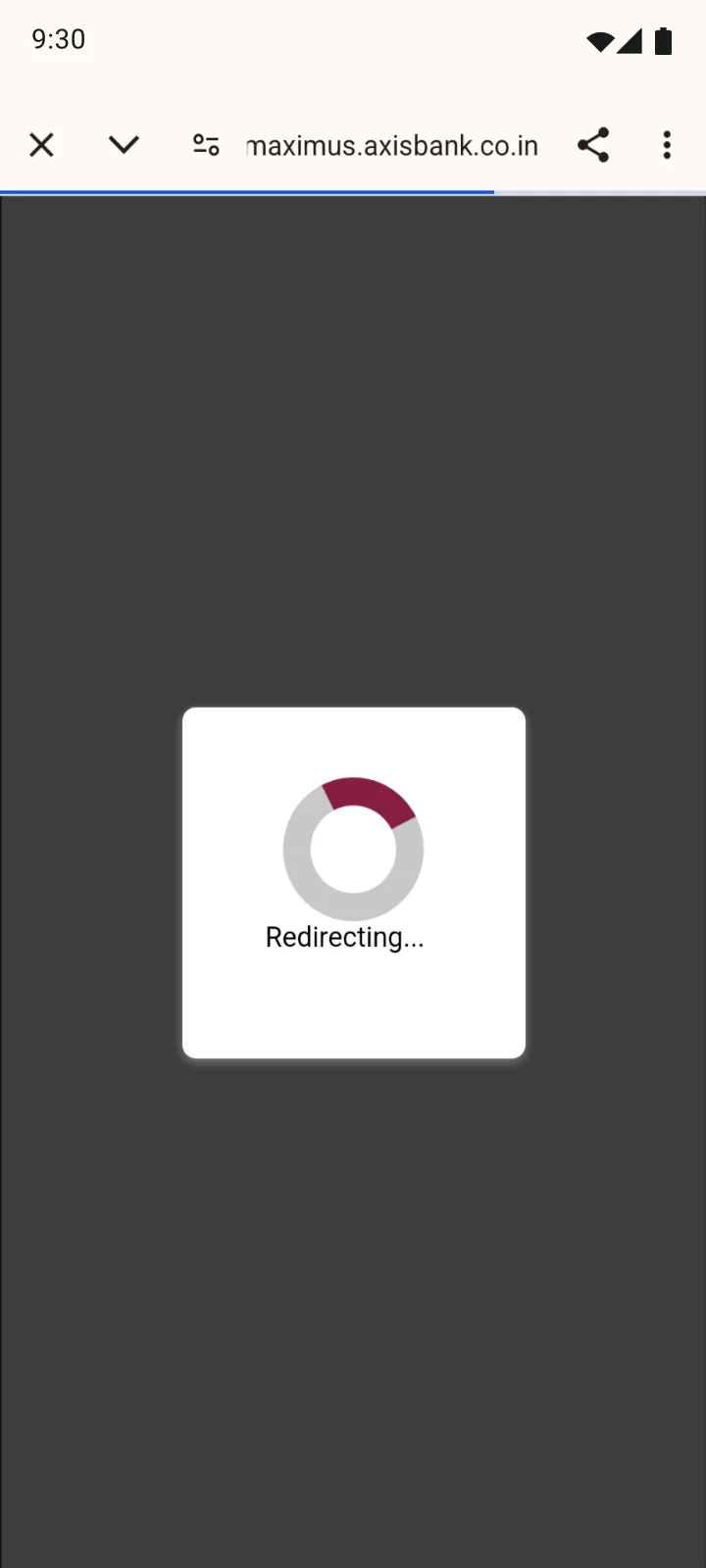
Every step happens in the app. The one exception is the bank’s video KYC page, and the app says so before it opens.
Principle 02
Show where you are
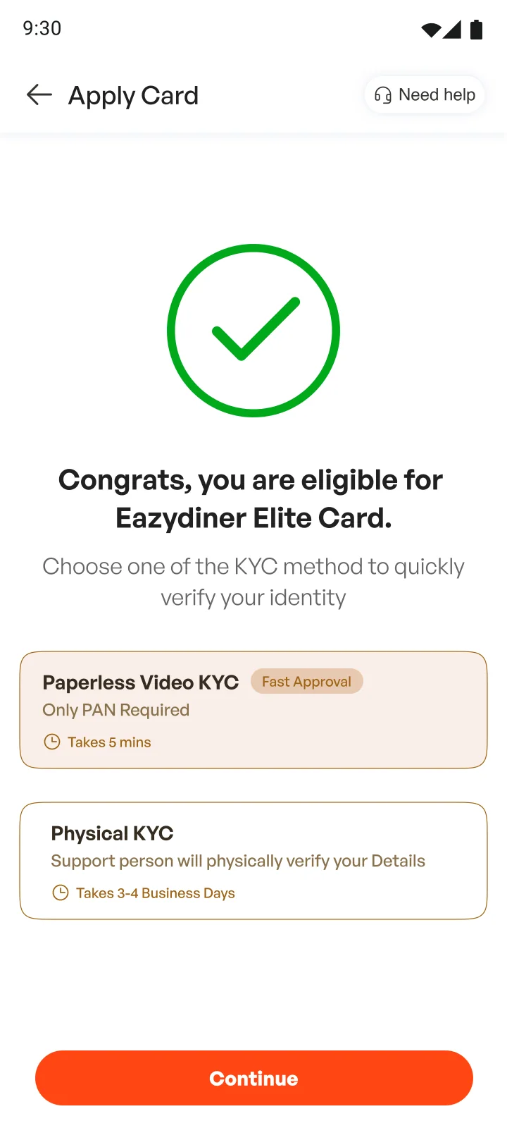
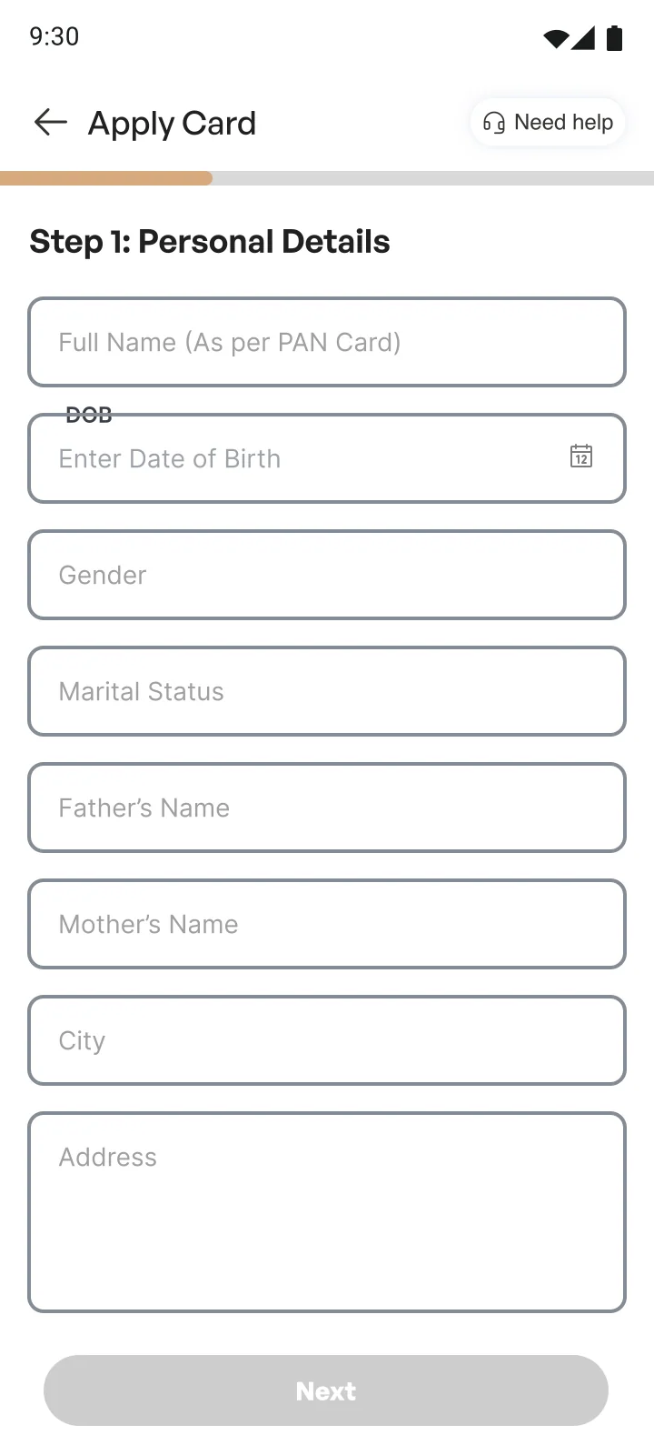
A progress bar on the form, a summary you can edit, and the time each KYC option takes.
Principle 03
Fees before the form
The joining and renewal fees are on the landing page, before anyone starts to apply.
Principle 04
Help on every step
“Need help” is in the header of every application step, and on the card home.
Principle 05
A tab for the card
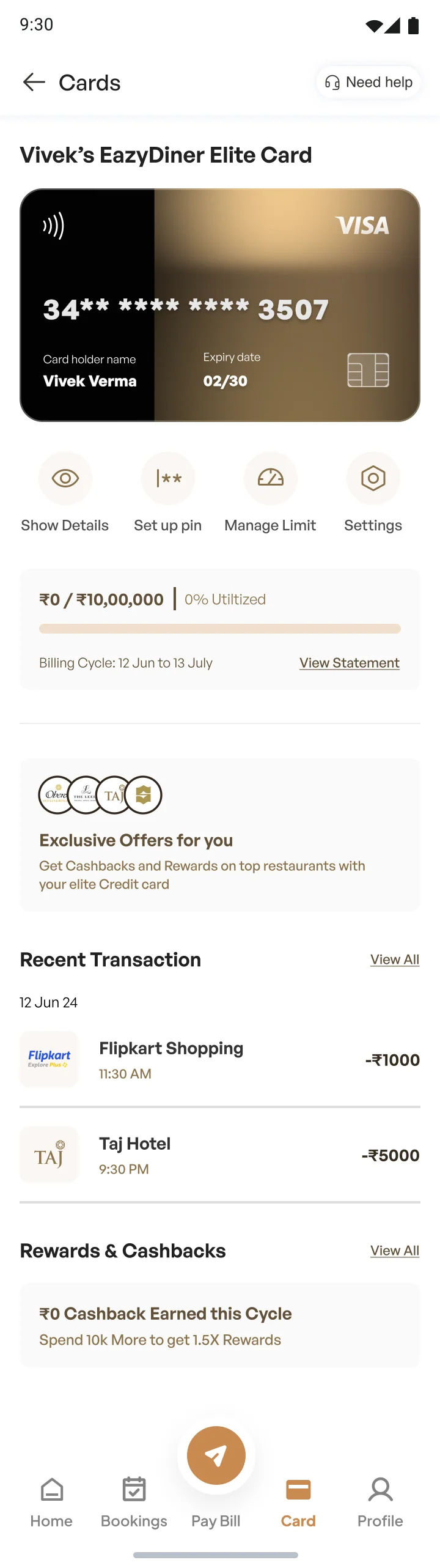
The card gets its own tab in the bottom navigation, next to Bookings and Pay Bill.
User flow
A 27-step flow, redrawn from my original FigJam board, covering both KYC routes and rejection.
Information architecture
Once the card is issued it gets its own tab with two levels. What people do every week is on the card home; what they do once a year is one level down.
Wireframes
Sixteen iPhone wireframes helped me work out the application form and KYC routes. Hover to scroll the longer screens.
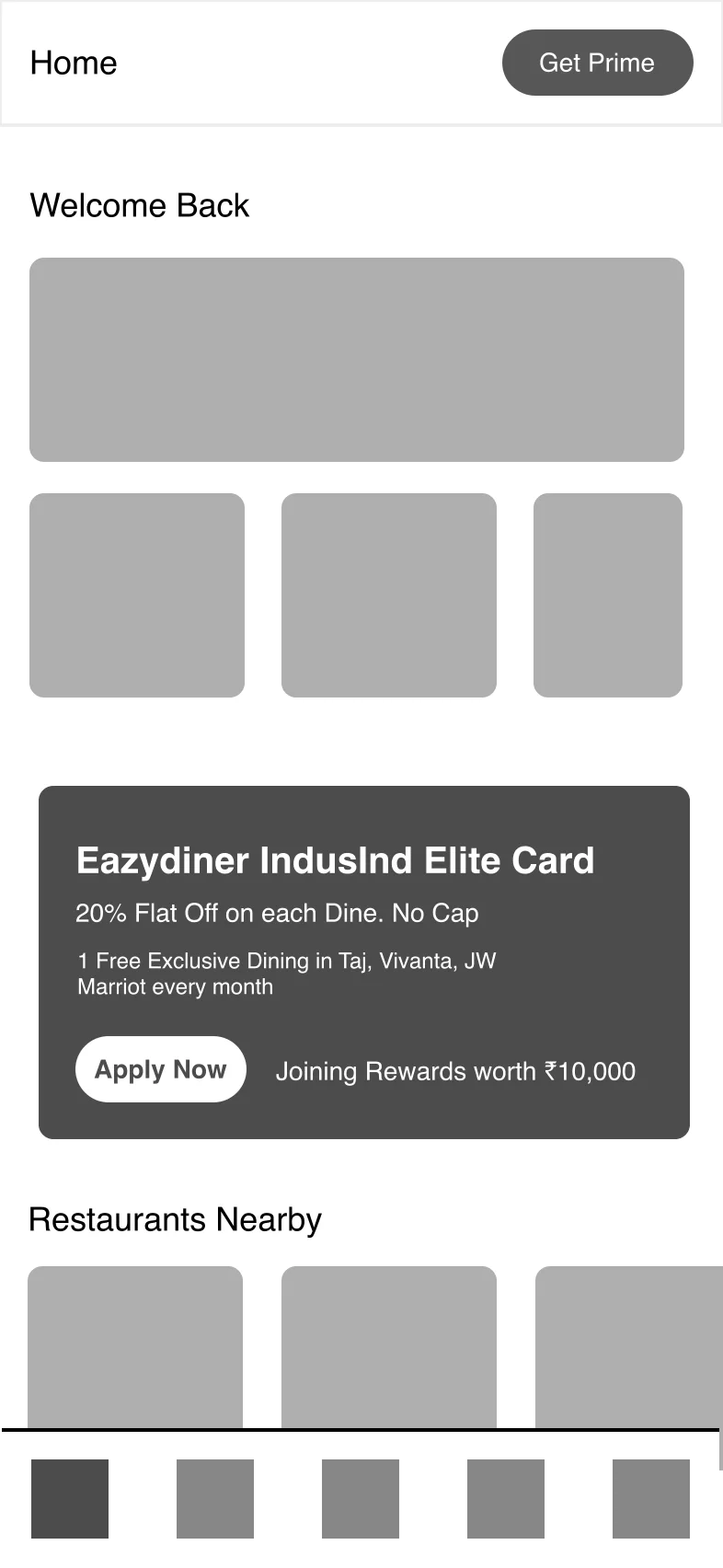
01 · Home feed 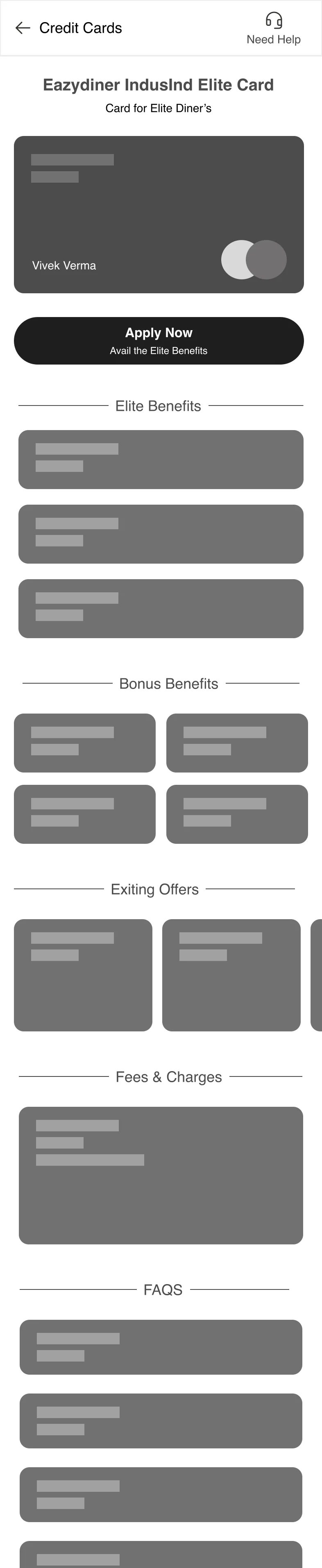
02 · Card landing page 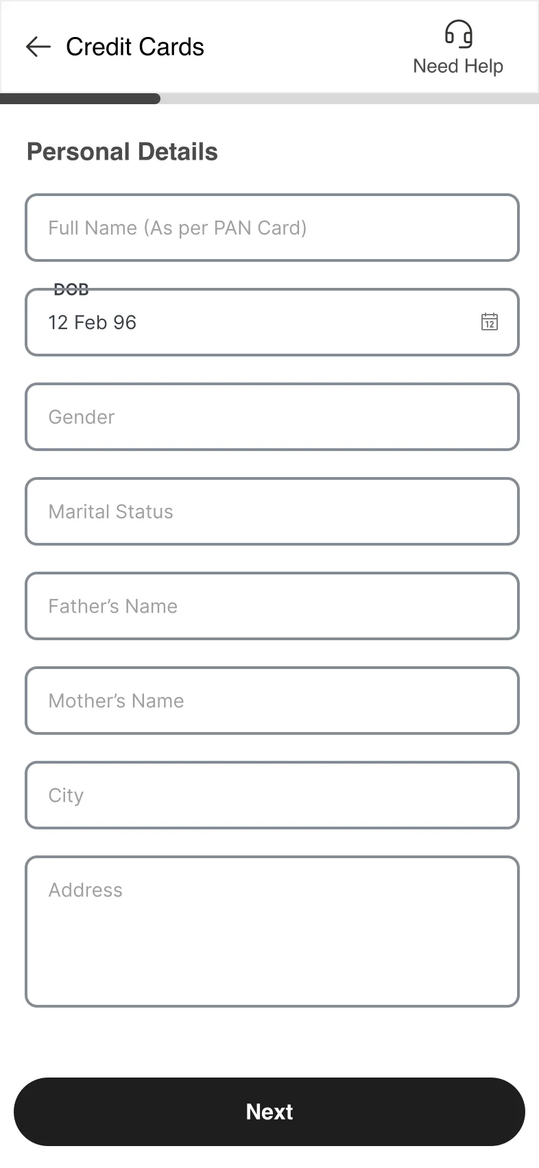
03 · Step 1, personal 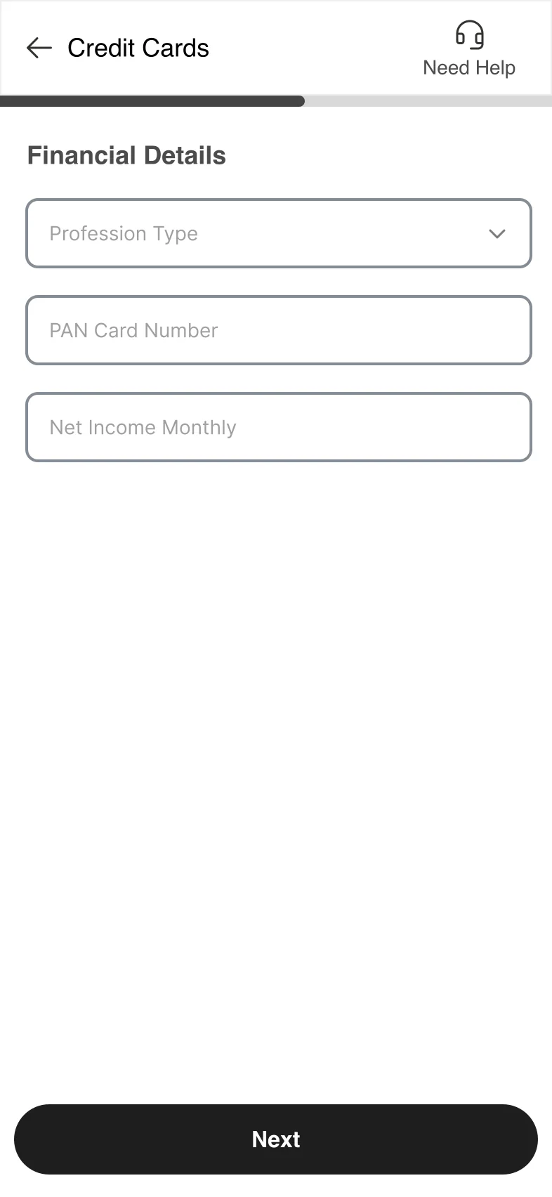
04 · Step 2, financial 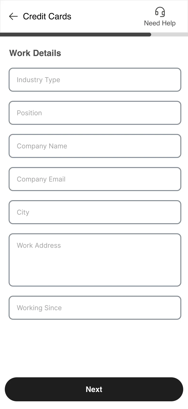
05 · Step 3, work 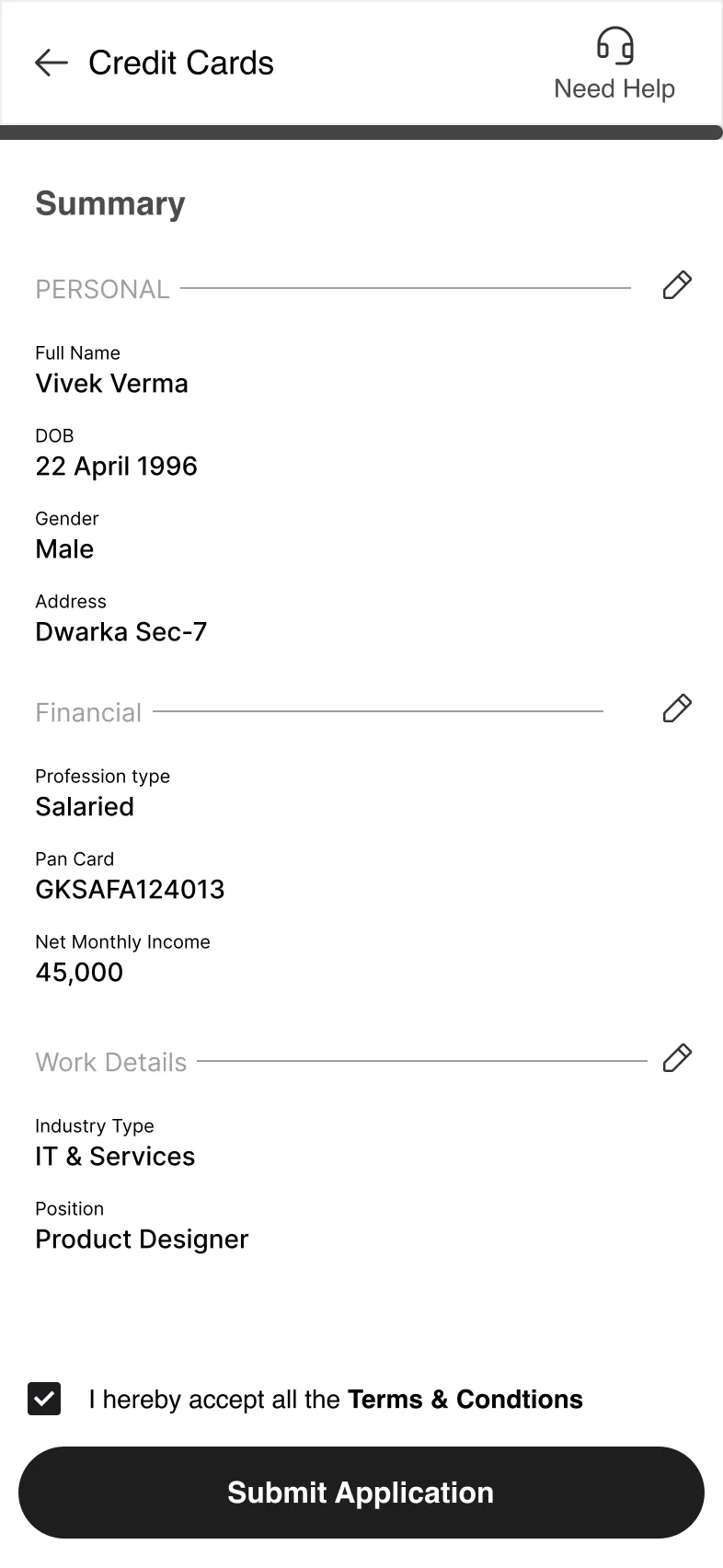
06 · Summary 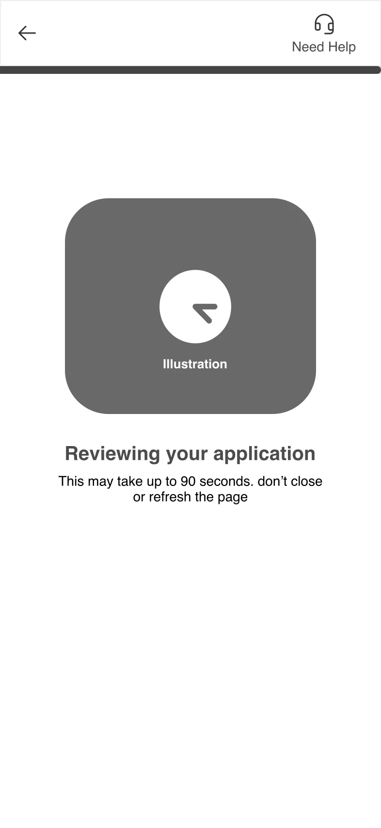
07 · Reviewing 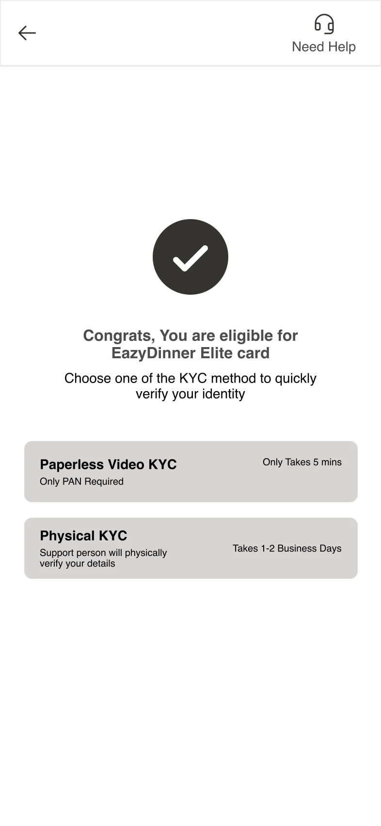
08 · Eligible, choose KYC 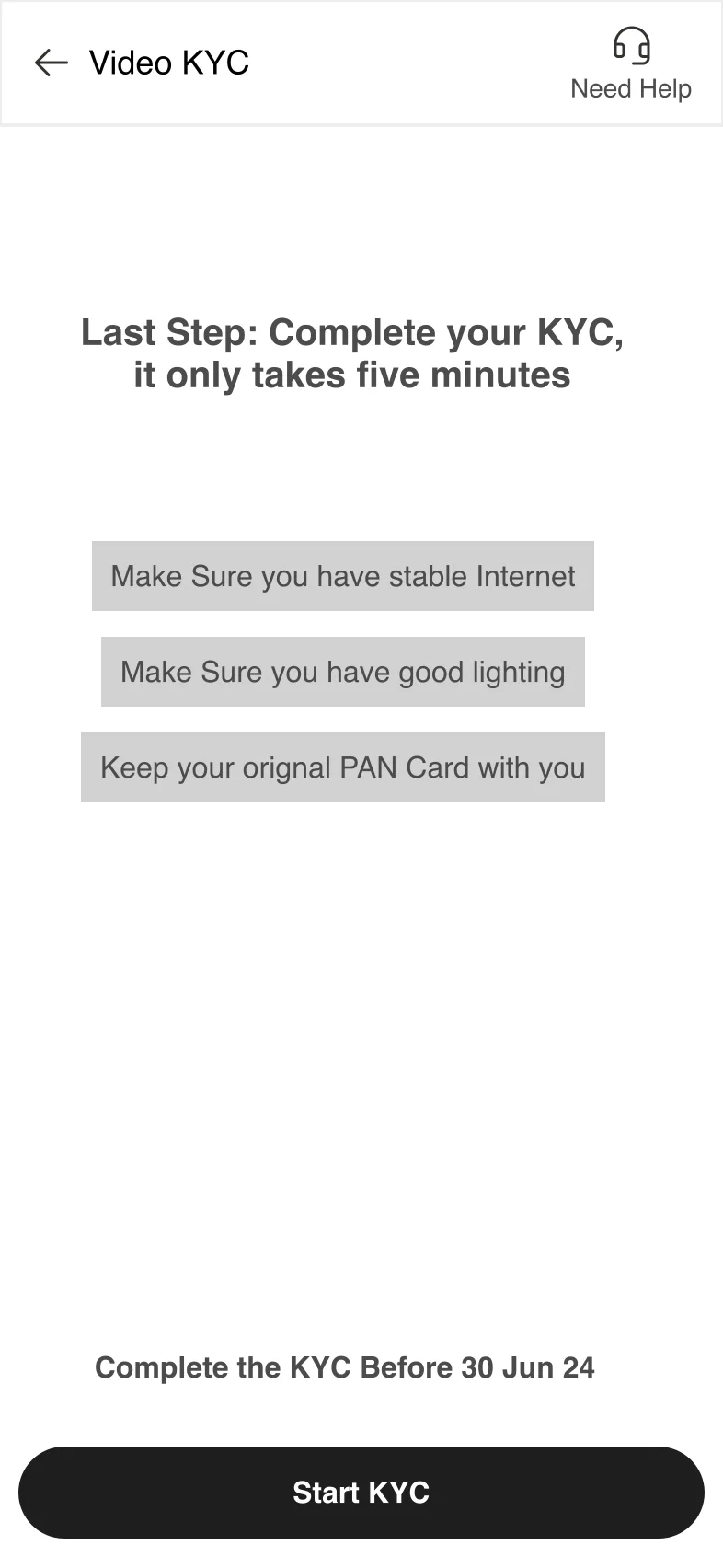
09 · Before video KYC 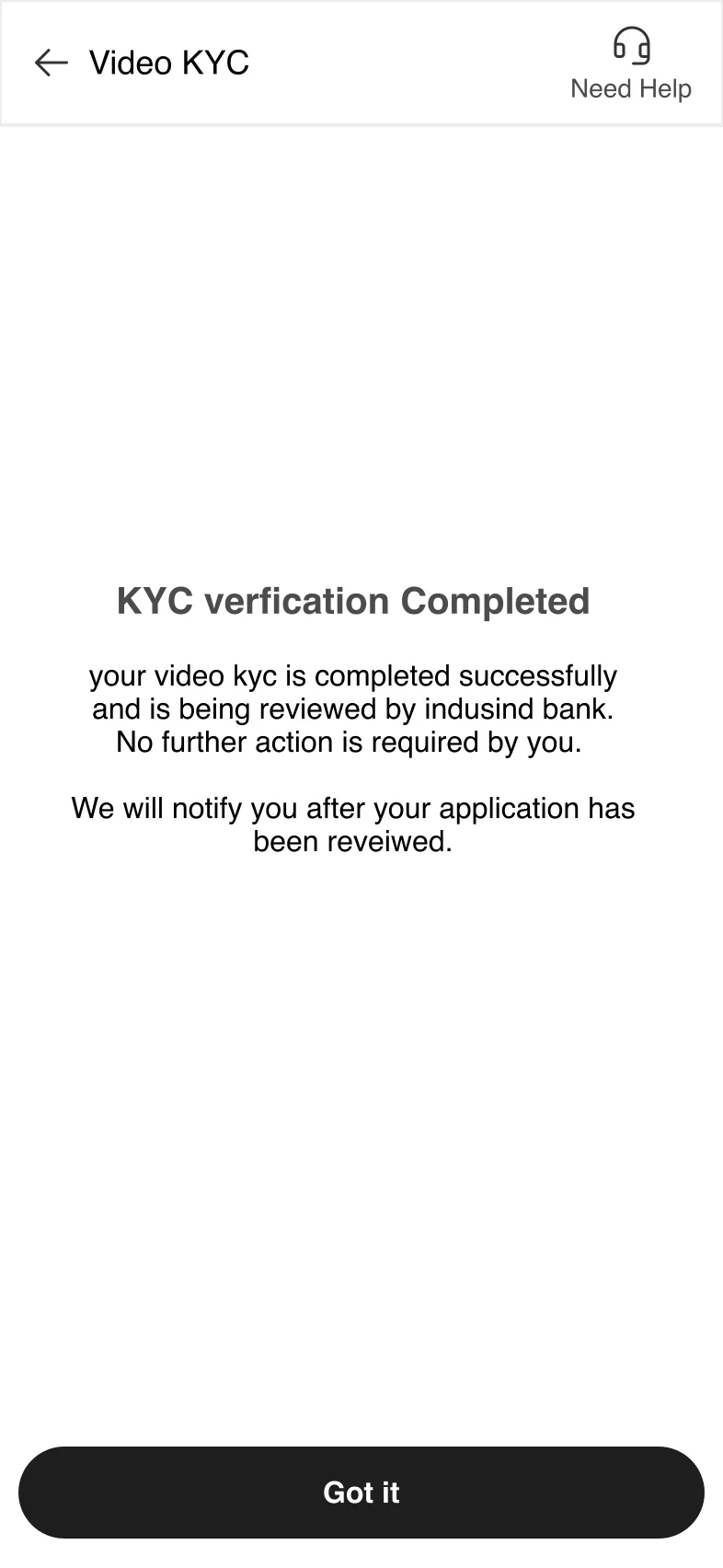
10 · KYC completed 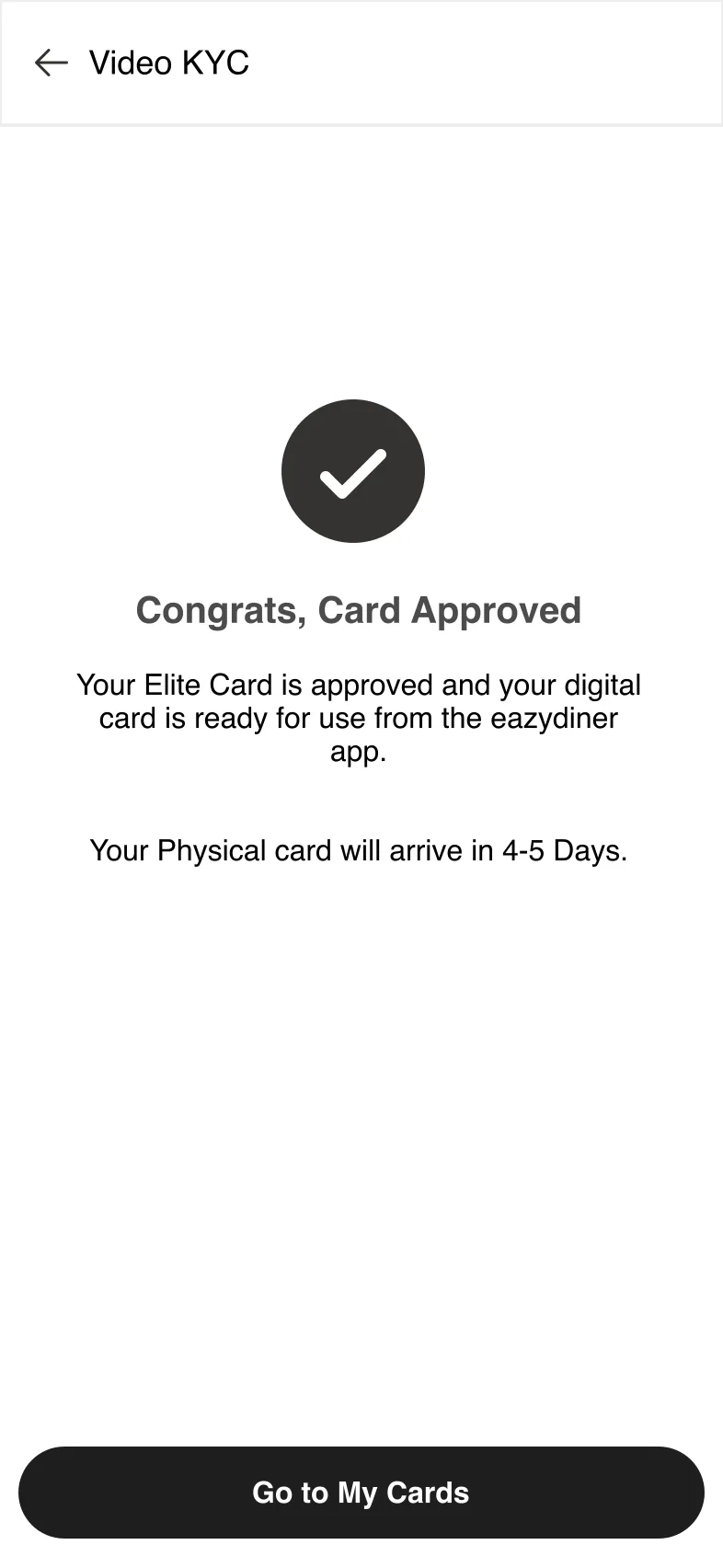
11 · Approved 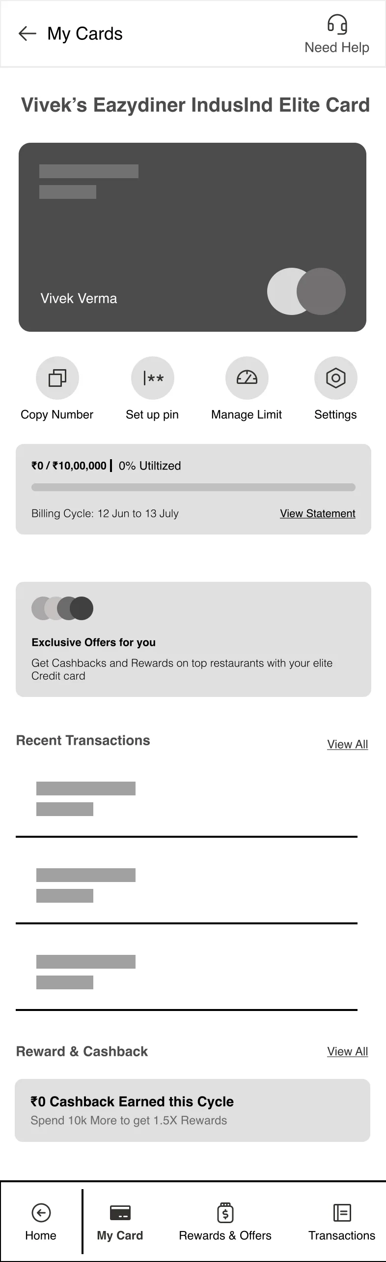
12 · My card 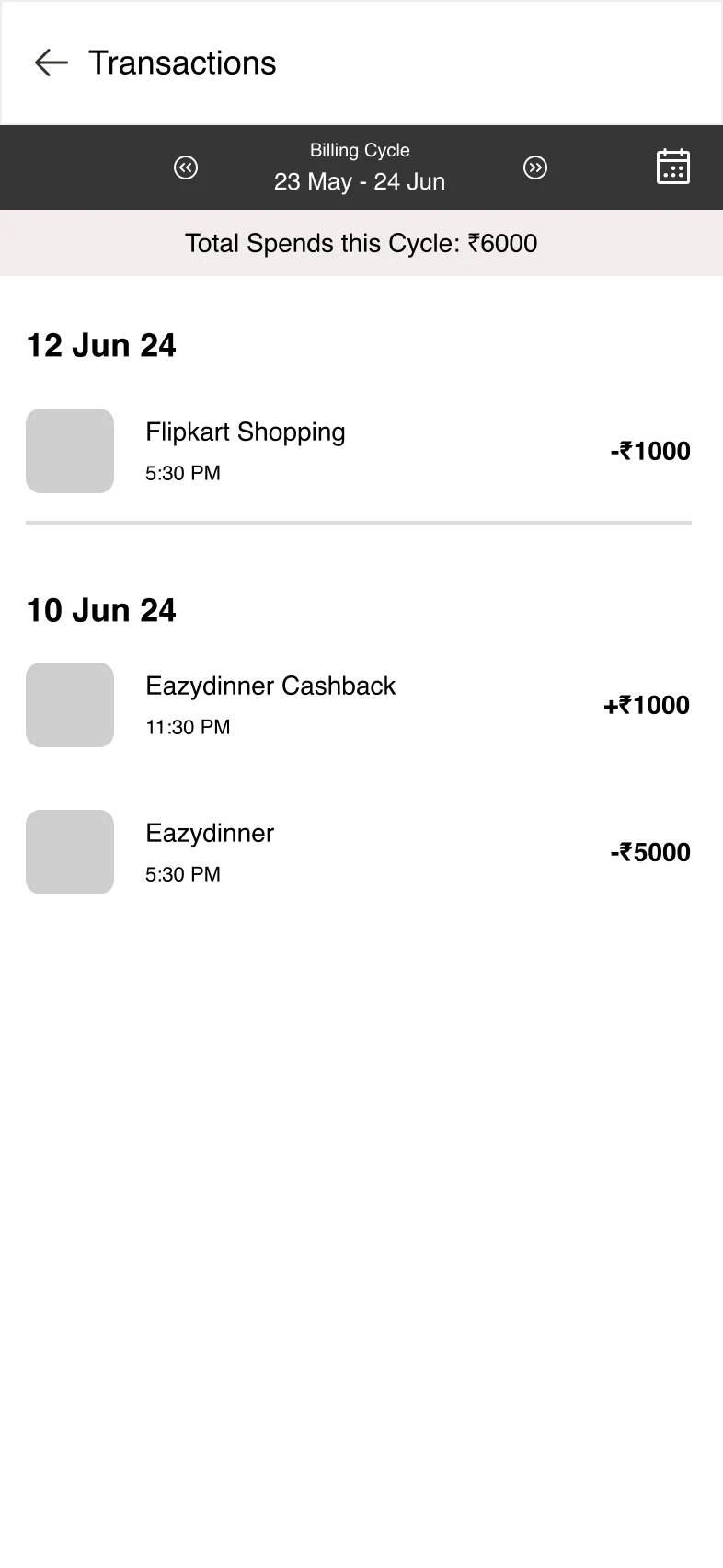
13 · Transactions 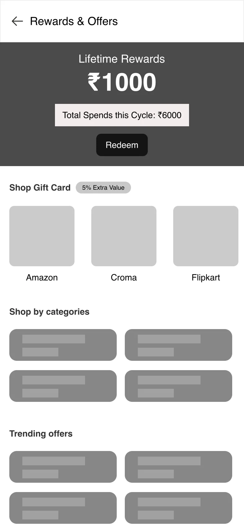
14 · Rewards and offers 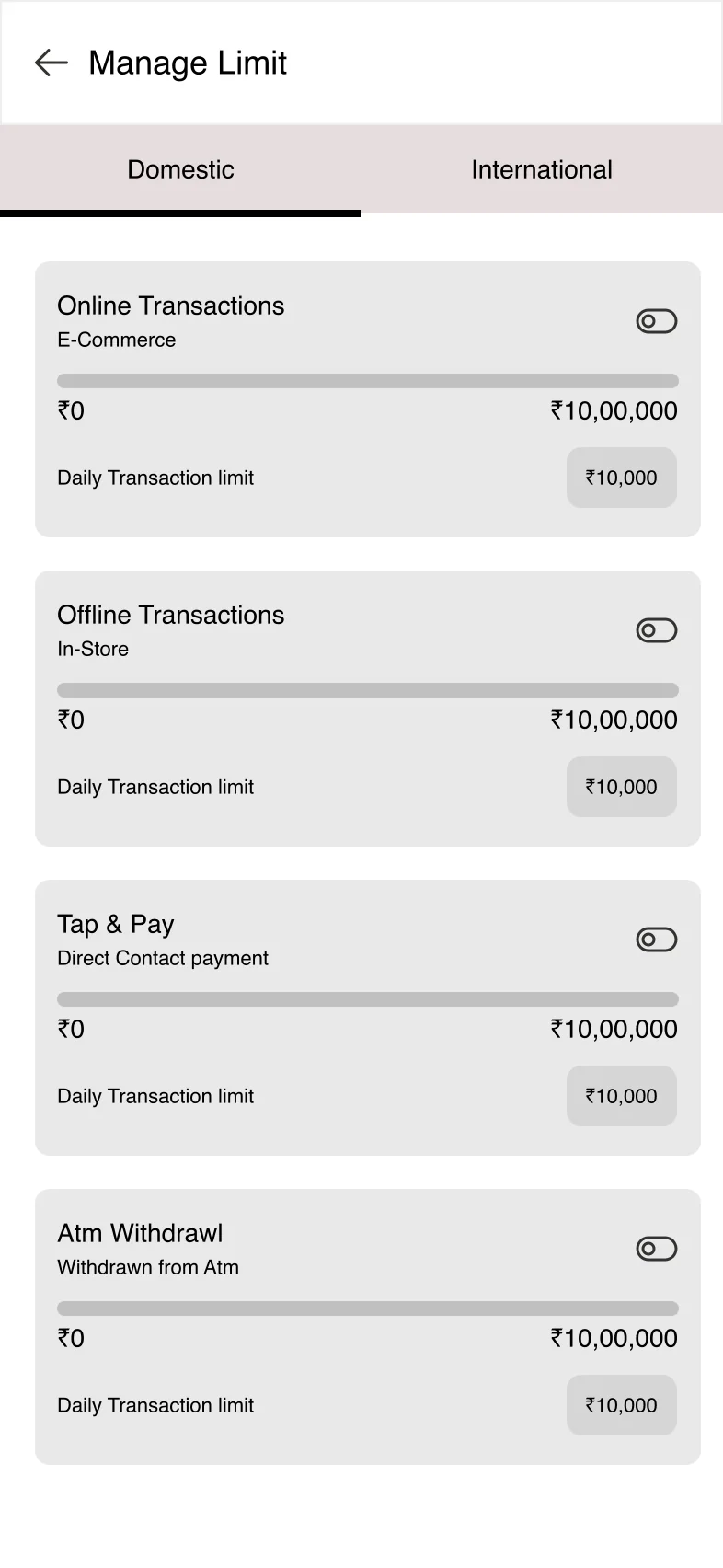
15 · Manage limits 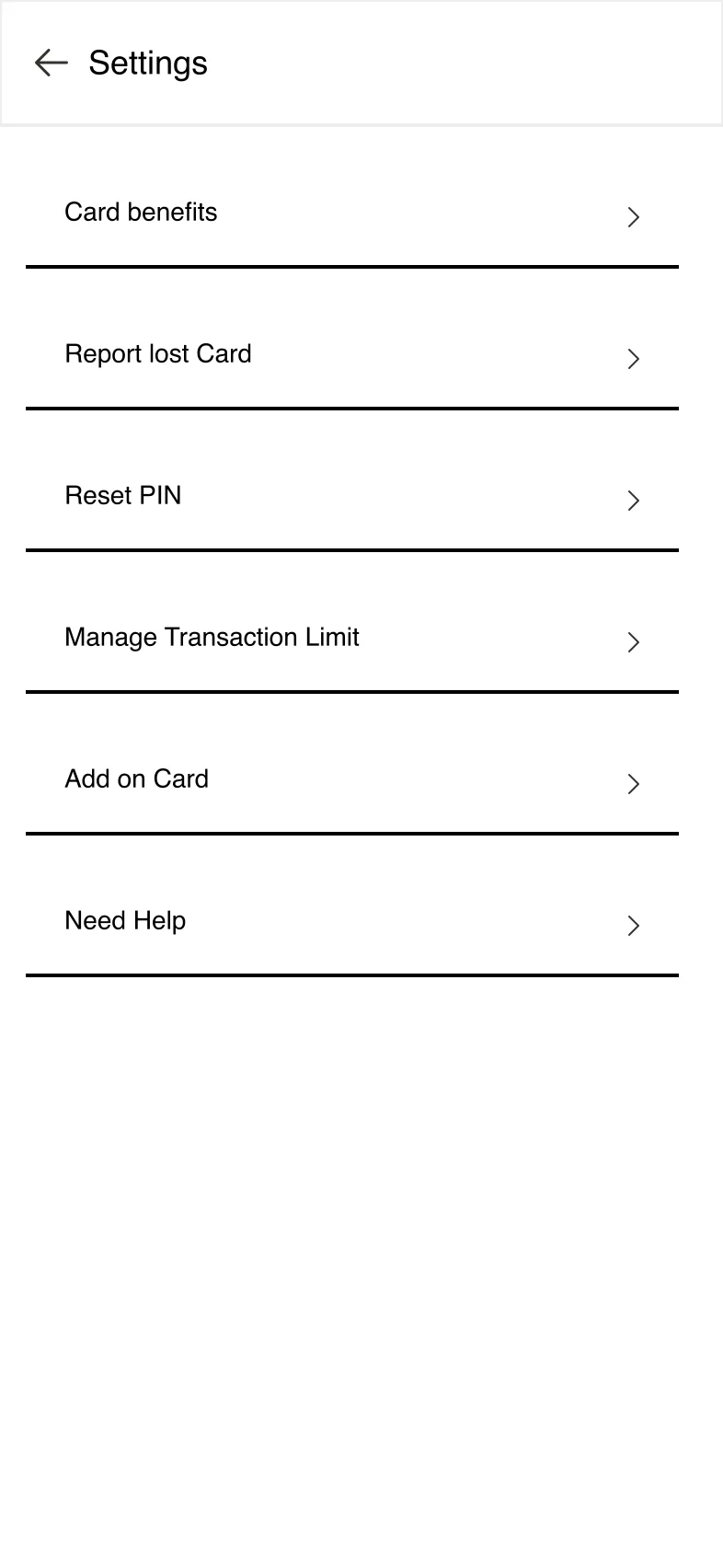
16 · Settings
Key decisions
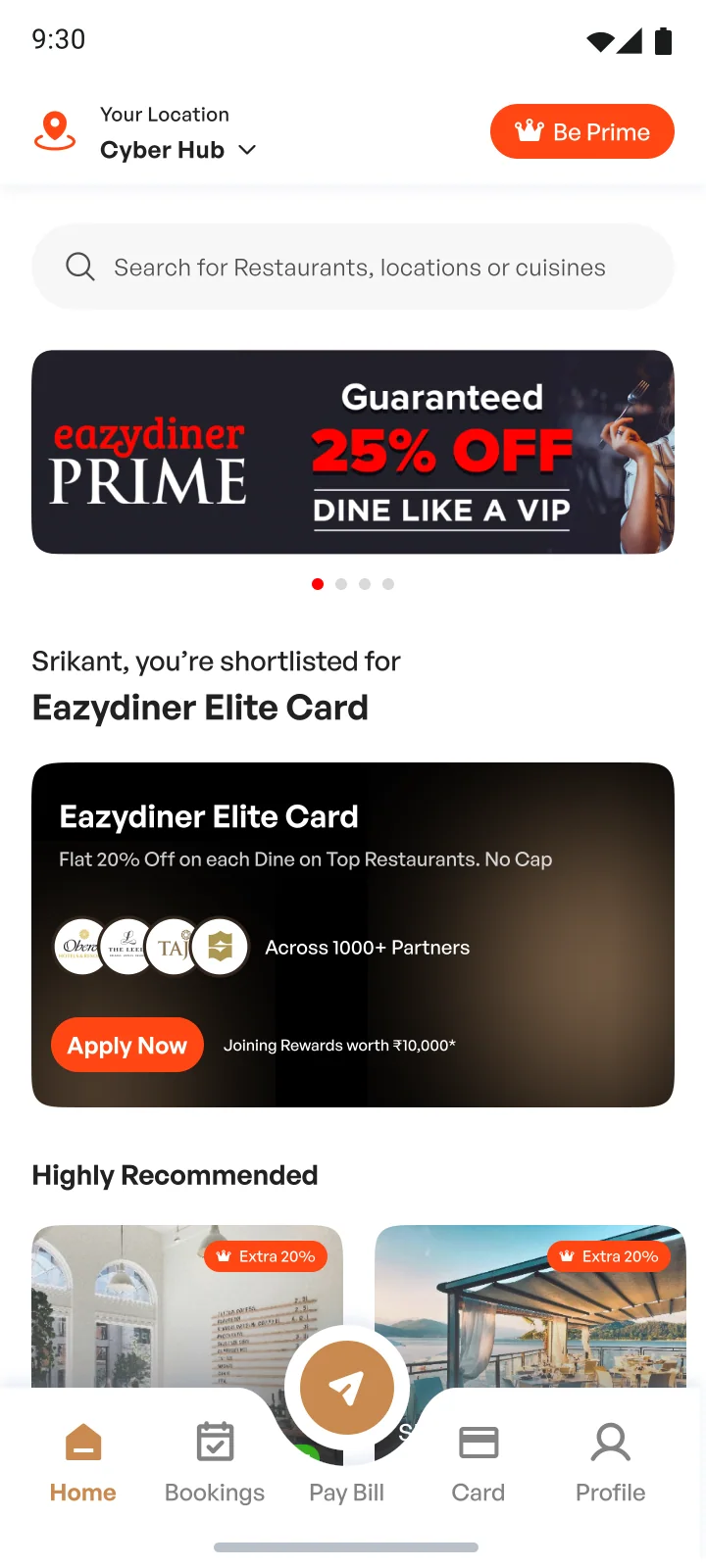
- The card shows up as a block in the home feed, between “Welcome back” and “Restaurants nearby”.
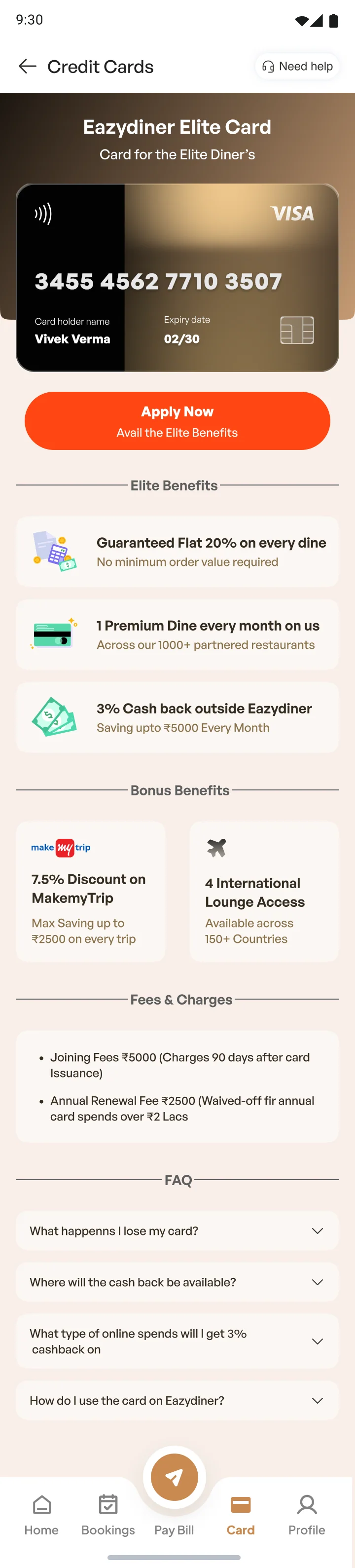
- The landing page goes through benefits, bonus benefits, offers, fees and FAQs, with a single “Apply now” button.
- The form is three steps (personal, financial, work), each short enough for one screen, with a progress bar. The summary groups answers by step, with an edit button on each group.
- The review screen says it can take up to 90 seconds, so nobody stares at a spinner wondering if it froze.
- KYC is two options with their time cost: video KYC takes about five minutes and needs only a PAN; physical KYC takes one to two business days.
- After approval the card gets a home screen with quick actions, credit used, offers, transactions and rewards. Transactions, limits and settings are one level down.
Visual design
The wireframes became Android screens in EazyDiner’s orange, with a five-colour palette I named during the 2026 redesign.
01 · Home feed 02 · Card landing page 03 · Step 1, personal 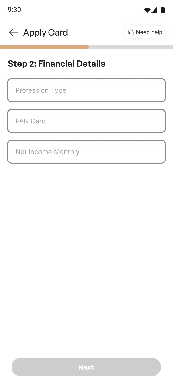
04 · Step 2, financial 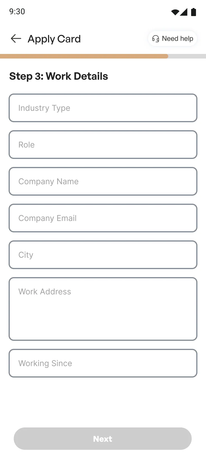
05 · Step 3, work 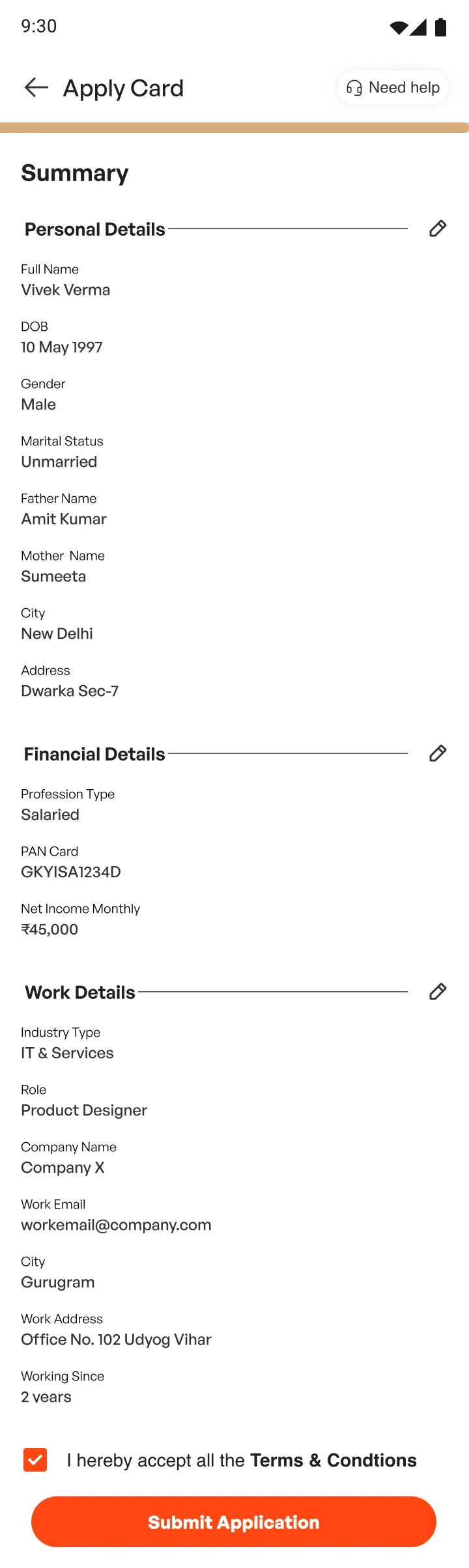
06 · Summary 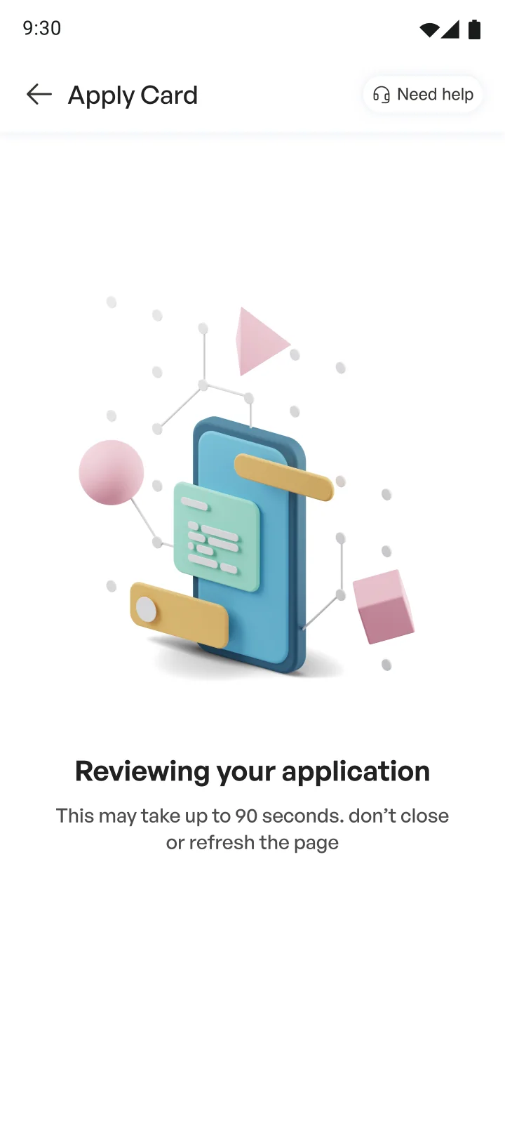
07 · Reviewing 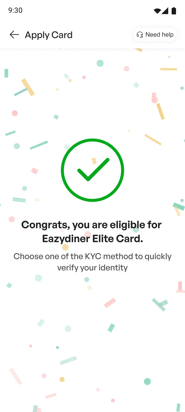
08 · Eligible 09 · Choosing KYC 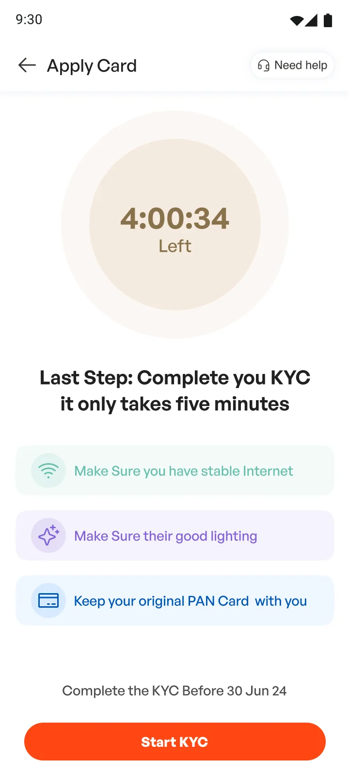
10 · Before video KYC 11 · The bank’s KYC page 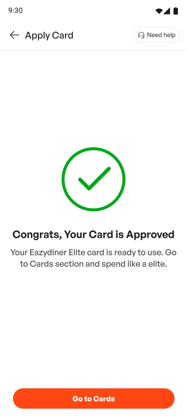
12 · Approved 13 · Card home 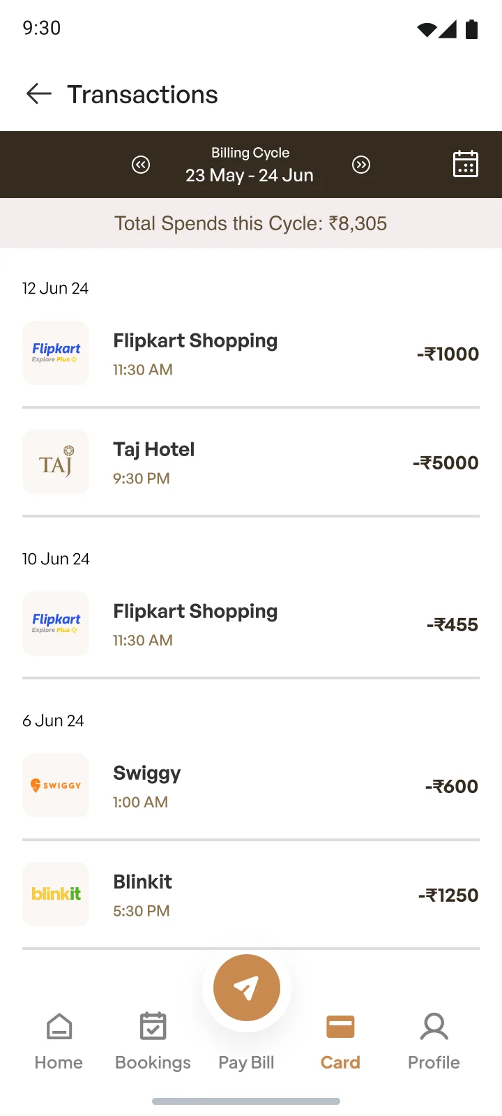
14 · Transactions 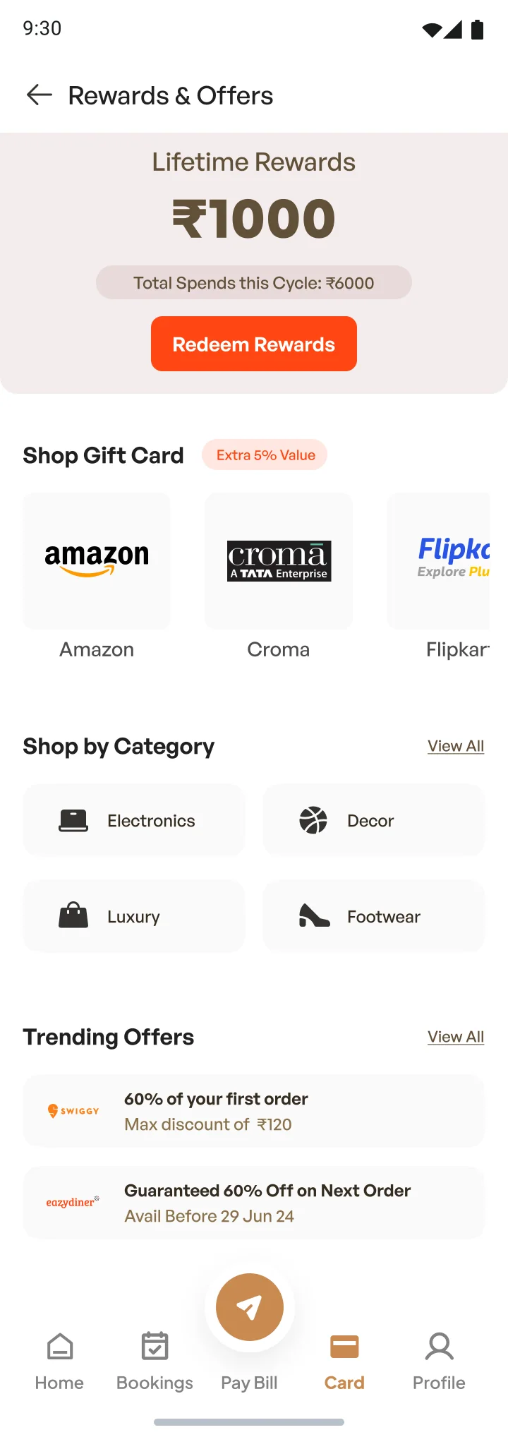
15 · Rewards and offers 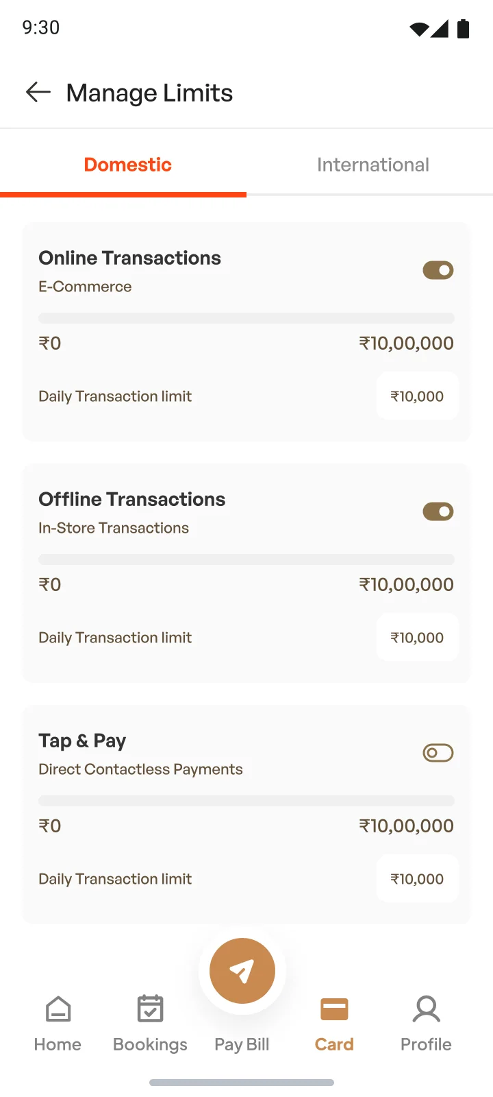
16 · Manage limits 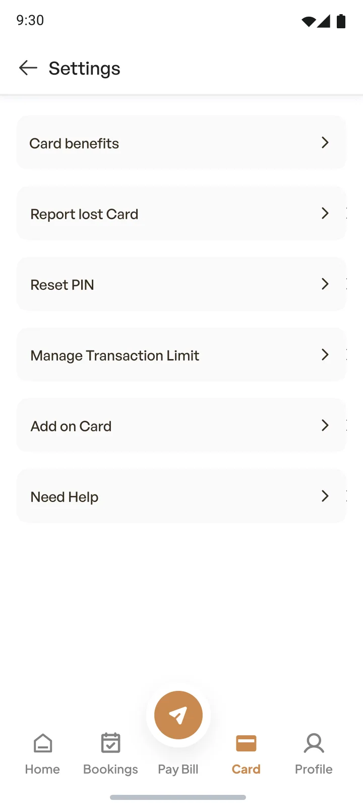
17 · Settings 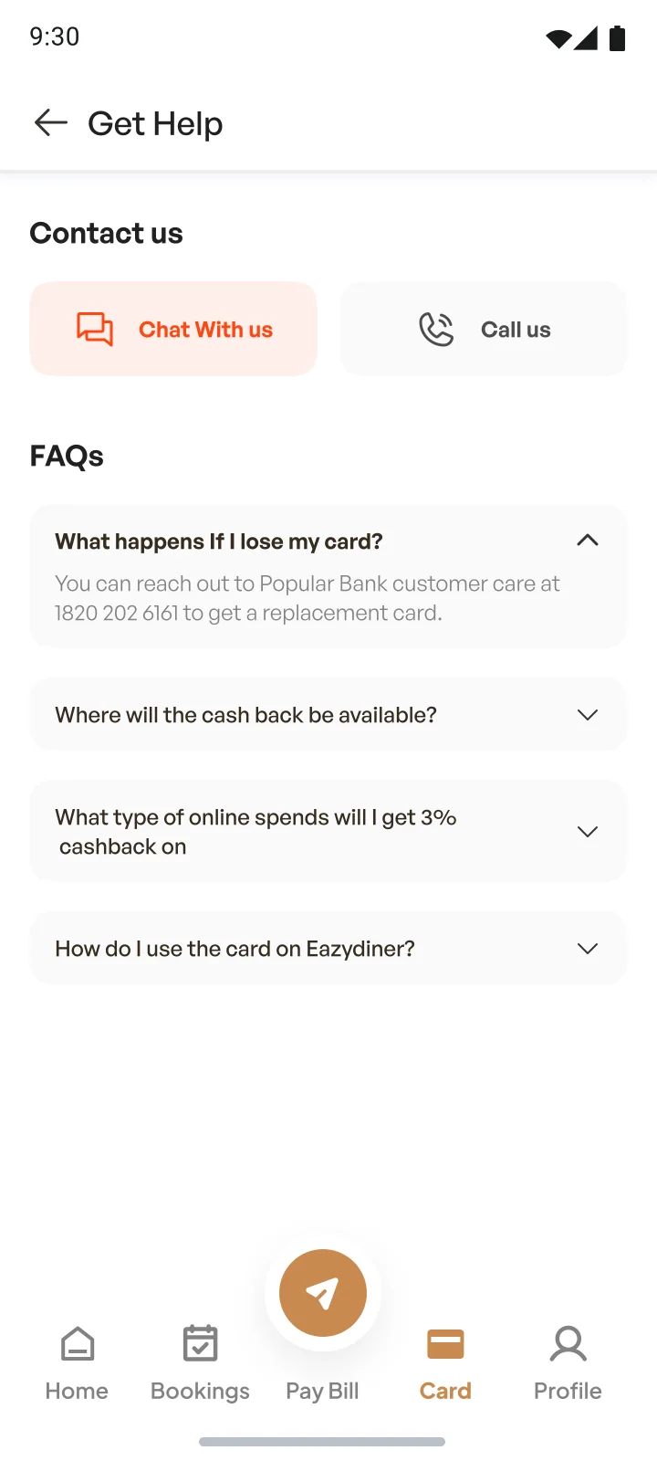
18 · Help
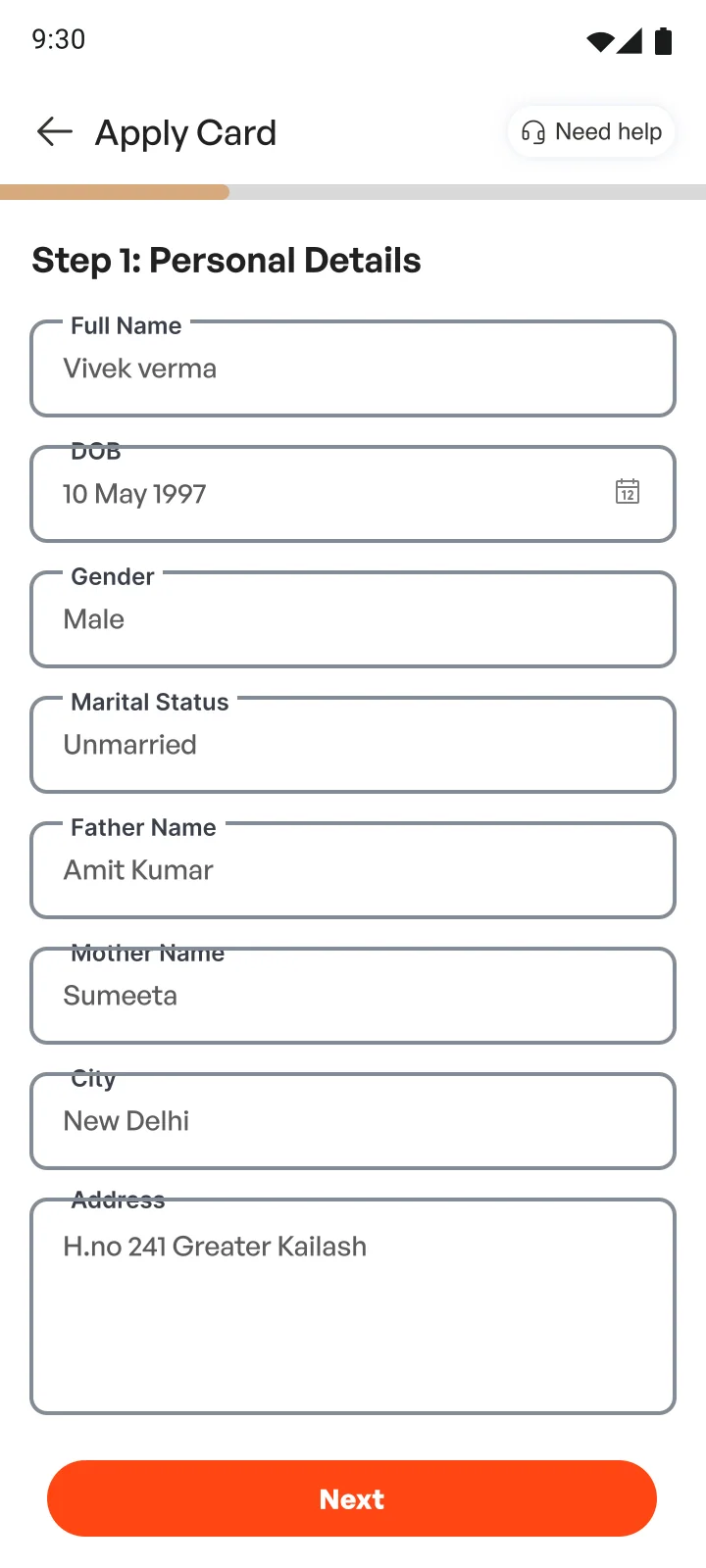
What changed from the wireframes
- The home feed says you’ve been shortlisted for the card, with a location switcher and a Prime banner.
- Benefits got illustrations, plus the bonus perks (a MakeMyTrip discount, lounge access) and a plain list of fees.
- Before KYC, a countdown shows how long the approval stays valid. Video KYC gets a “Fast approval” badge.
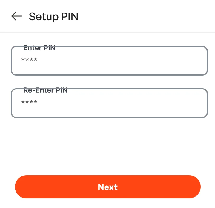
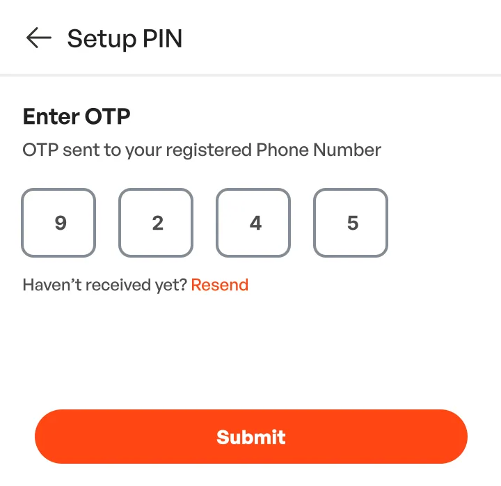
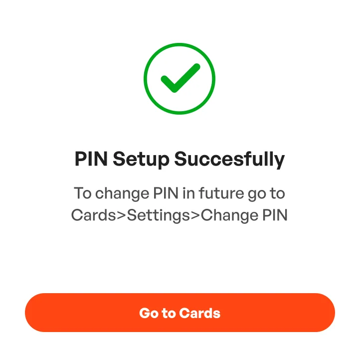
- Five tabs at the bottom, with Pay Bill as a raised button in the middle. PIN setup is a bottom sheet with an OTP step.
- Every form step is drawn empty and filled. Labels sit inside the field, then move into the border as you type. The grey failed contrast, so in 2026 they moved above the field.
Prototype
24 screens, 5 bottom sheets and 57 links, connected on the second day.
What only the prototype shows
- “Reviewing” and “Redirecting to the bank” move on by themselves.
- The PIN sheet switches between PIN, OTP and success without leaving the screen.
- “Show details” reveals the full card number, with a copy button.
- Long screens scroll under a fixed header, bottom navigation and buttons, the way they would on a phone.
Design audit
In 2026 I found six gaps in the 2024 screens, including what happens after someone applies, and rebuilt six screens.
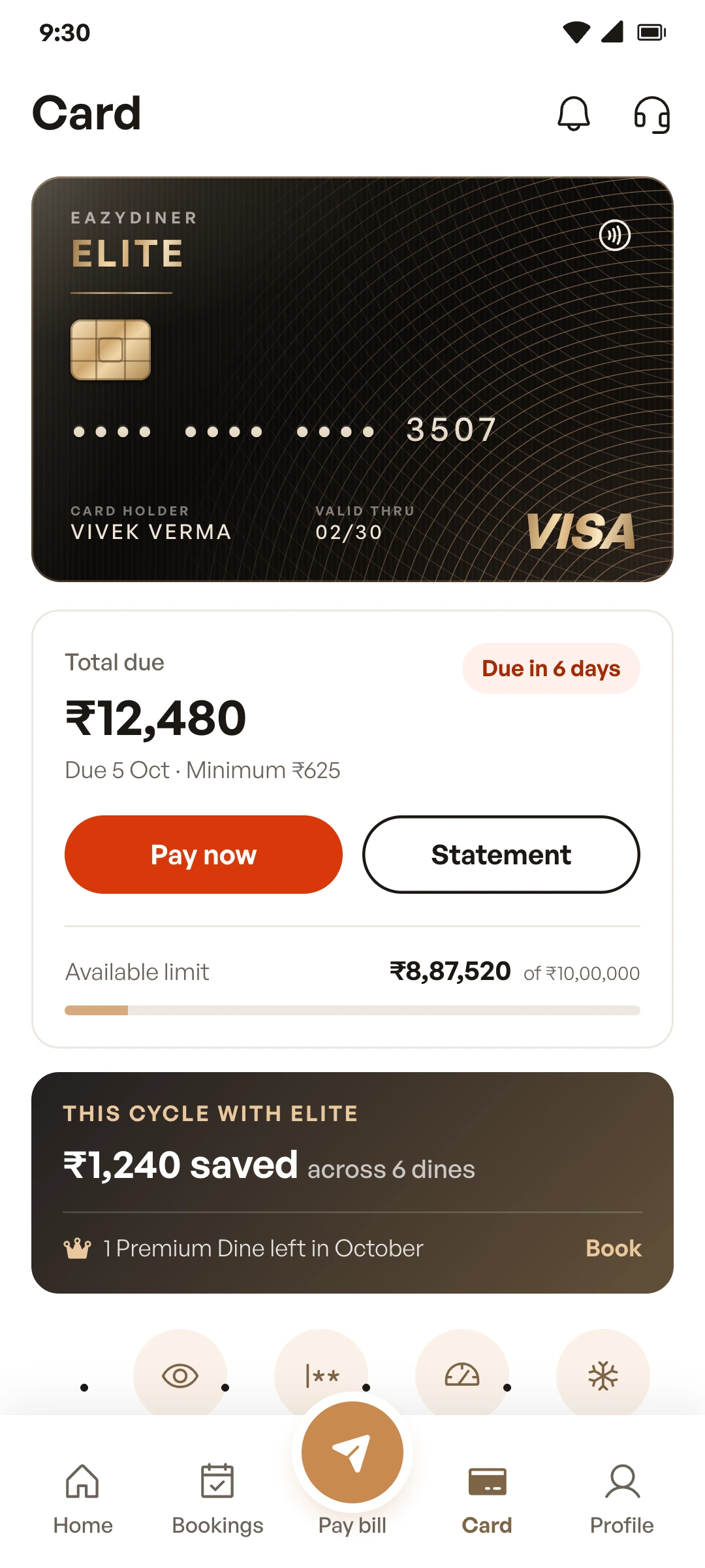
ProblemThe card home had no amount due. It started with the card, quick actions and “₹0 / ₹10,00,000, 0% utilized”: no due date, and no way to pay.
What changedThe statement sits right under the card: the total due, the due date, the minimum due and a Pay now button.
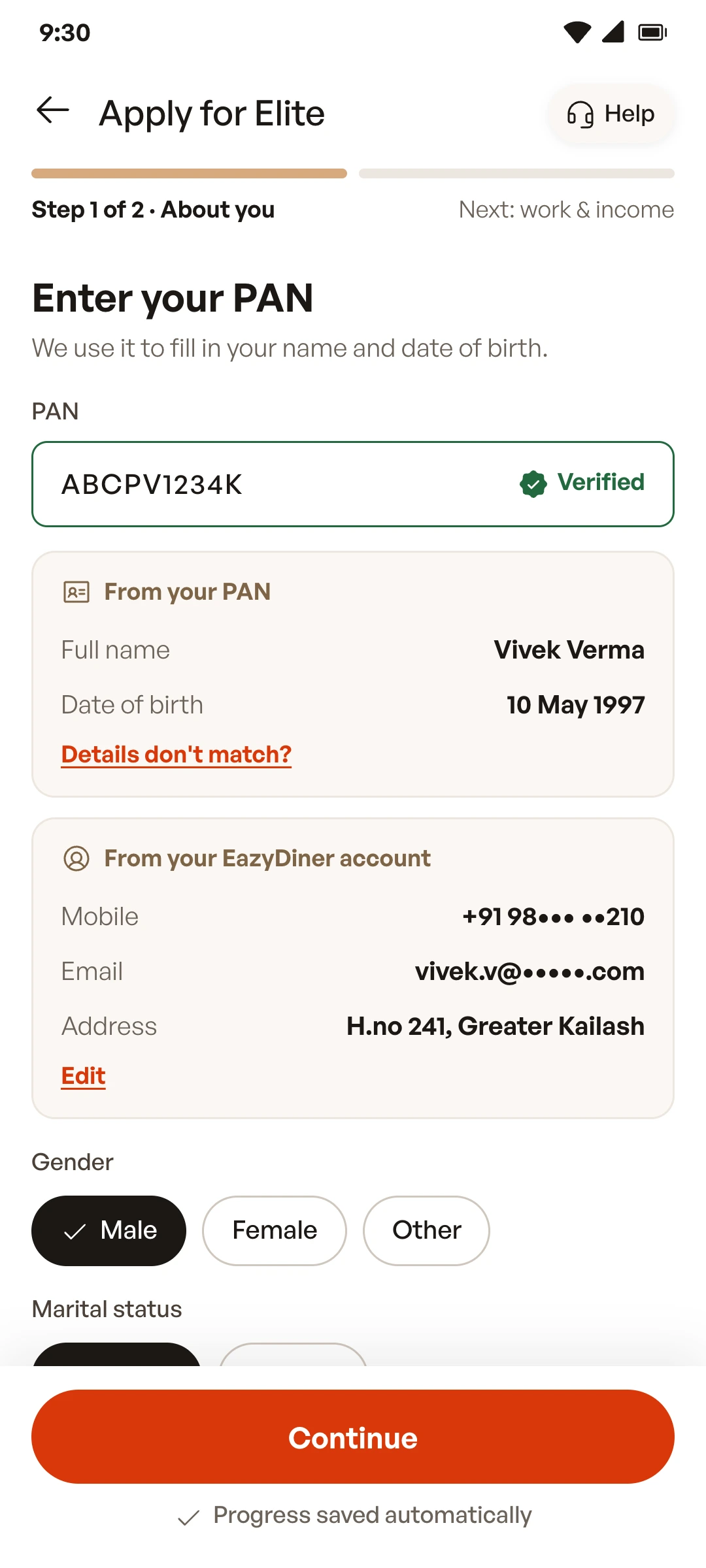
ProblemToo much typing. The three form steps had 18 fields between them, and some of it, like name and date of birth, is already linked to the PAN.
What changedThe PAN comes first and fills in the name and date of birth; contact details and address come from the EazyDiner account. Step 1 goes from 8 typed fields to 3, and the form from three steps to two.
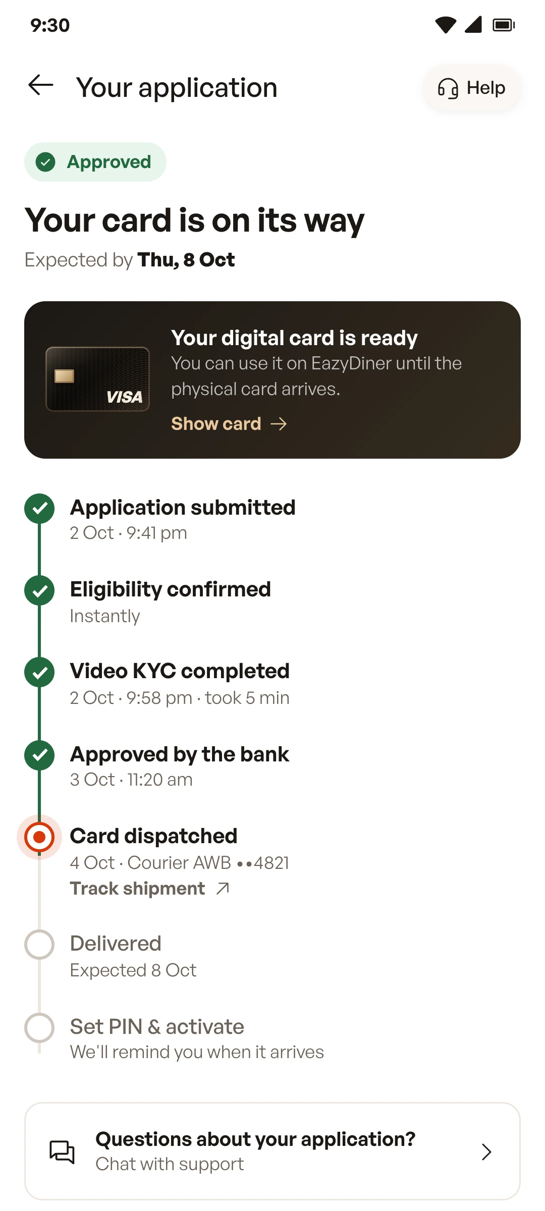
ProblemNo screen for the wait. The flow has four steps between approval and first use, but the screens went straight from “Approved” to the card home.
What changedA tracker that shows each step with a date, the courier reference, and a link to the digital card, so it can be used before the physical card arrives.
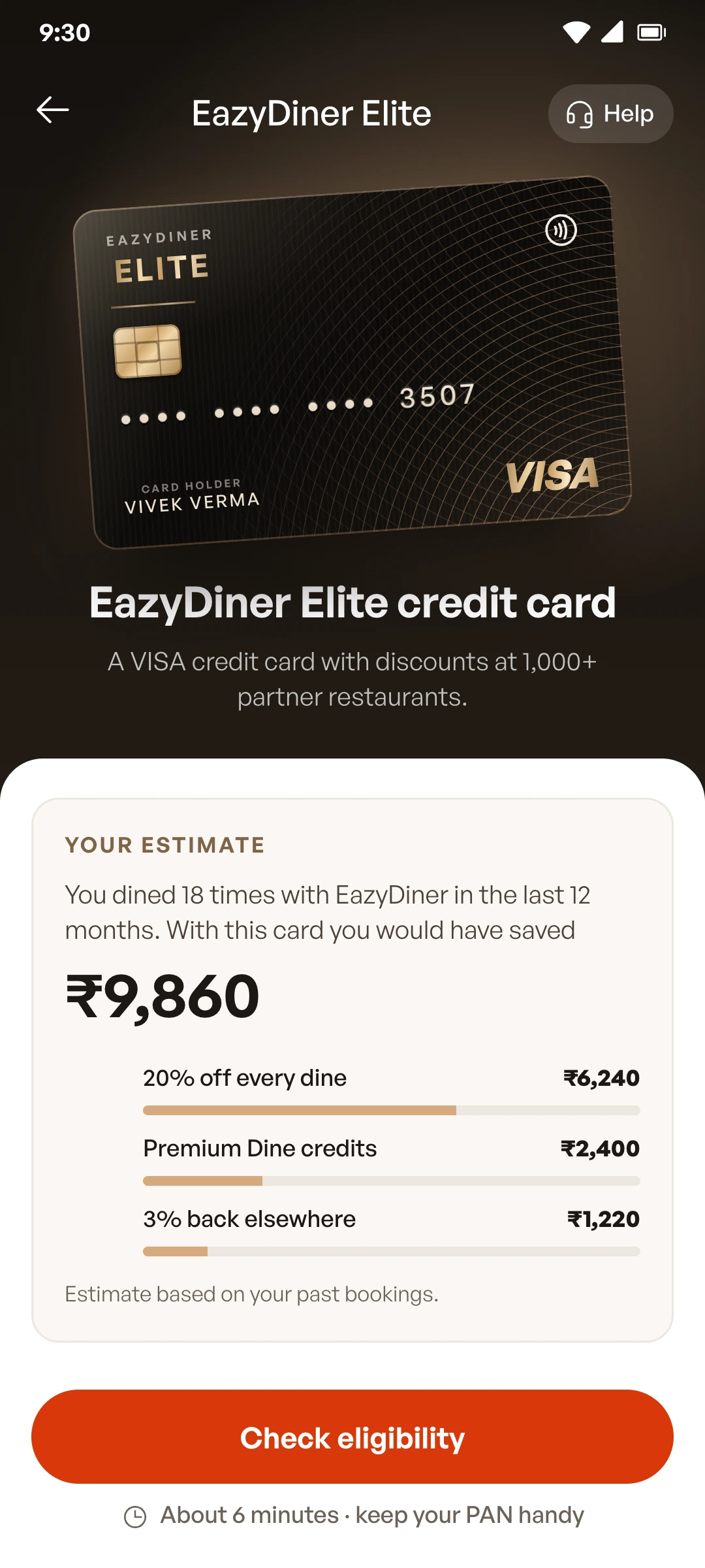
ProblemThe benefits weren’t personal. Everyone saw the same list, though EazyDiner already knows how often someone books.
What changedThe landing page estimates what the card would have saved over the past year, next to the fees. A concept: it would need real data and a legal review before it could ship.
ProblemThe rejection path had no screen. The flow included a reason and “apply again in 6 months”, but I never designed it.
What changedNow it exists, with the reason, the date you can reapply, an option to get a reminder, and Prime as an alternative.
ProblemContrast. White text on #FF4612 is 3.42:1, below the 4.5:1 that the WCAG AA accessibility standard asks for in normal text. The placeholder grey was 2.68:1, and doubled as the field label.
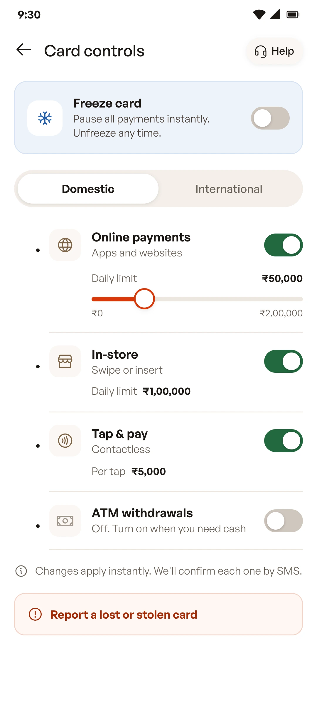
What changedButtons use a darker orange (#D8380A, 4.68:1), and fields have labels above them. In card controls I also added a switch to freeze the card, at the top.
Design system
In 2026 I named the colours, checked contrast and settled on one typeface, Phosphor icons and a 4 and 8 px spacing grid.
Contrast, 2024 and 2026
3.42 : 1White on #FF4612, 2024. Fails AA.
4.68 : 1White on #D8380A, 2026. Passes AA.
AaThe 2024 placeholder, #9E9E9E, doing the label’s job
2.68 : 1On white. Fails, and it’s gone once you type.
AaThe 2026 label above the field, ink-2 #6B6259
5.97 : 1On white. Passes AA, and it stays put.
Type · General Sans, six sizes
- ₹12,48024 semibold · amounts
- Your card is on its way20 semibold · screen titles
- Apply for Elite18 medium · app bar
- Step 1: Personal details16 semibold · section headings
- Flat 20% off every dine14 semibold · labels, buttons
- No minimum bill12 medium · body, captions
The 2024 prototype used 31 combinations of font, weight and size across five families.
Final screens
Six screens rebuilt in 2026; drag across four of them to compare with the 2024 versions.
1 of 4
Landing page
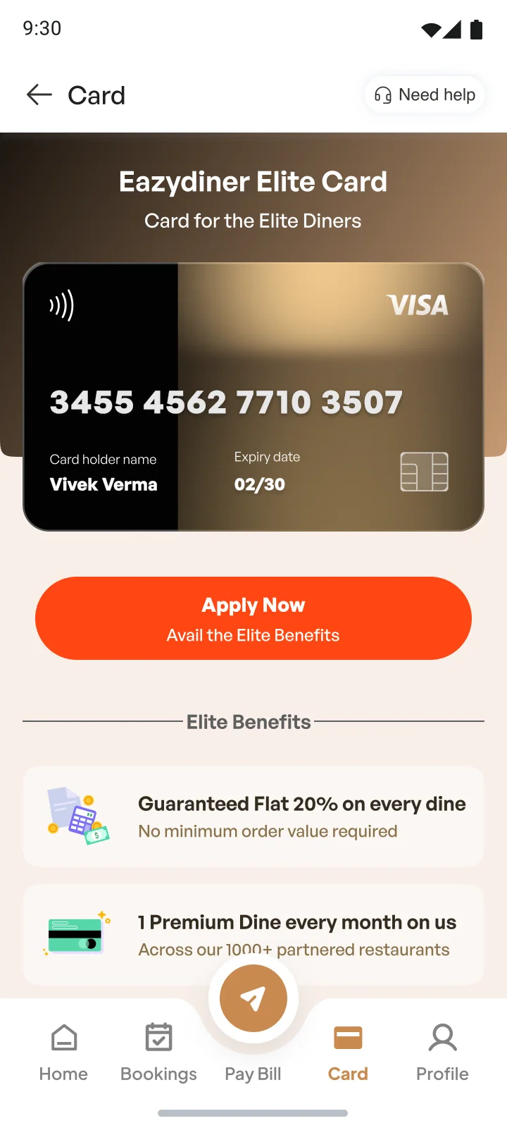
- “Check eligibility” as the first tap, a smaller commitment than “Apply now”.
- A savings estimate from the person’s own bookings comes before the list of benefits.
- Fees and the ₹2 lakh waiver are on the same screen as the benefits.
2 of 4
Application, step 1
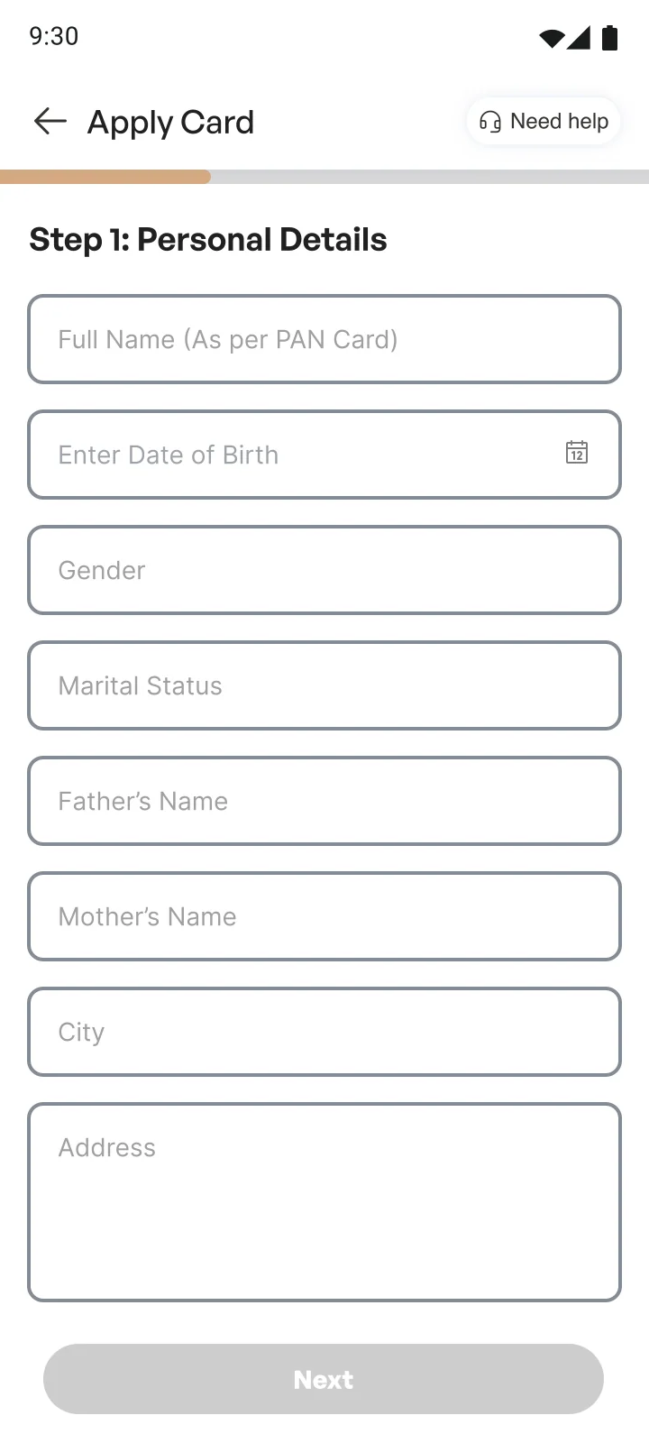
- Two steps instead of three, and the progress bar names the next one.
- 3 typed fields instead of 8. Gender and marital status are one tap each.
- Labels stay above the fields, so they don’t disappear when you start typing.
3 of 4
After approval
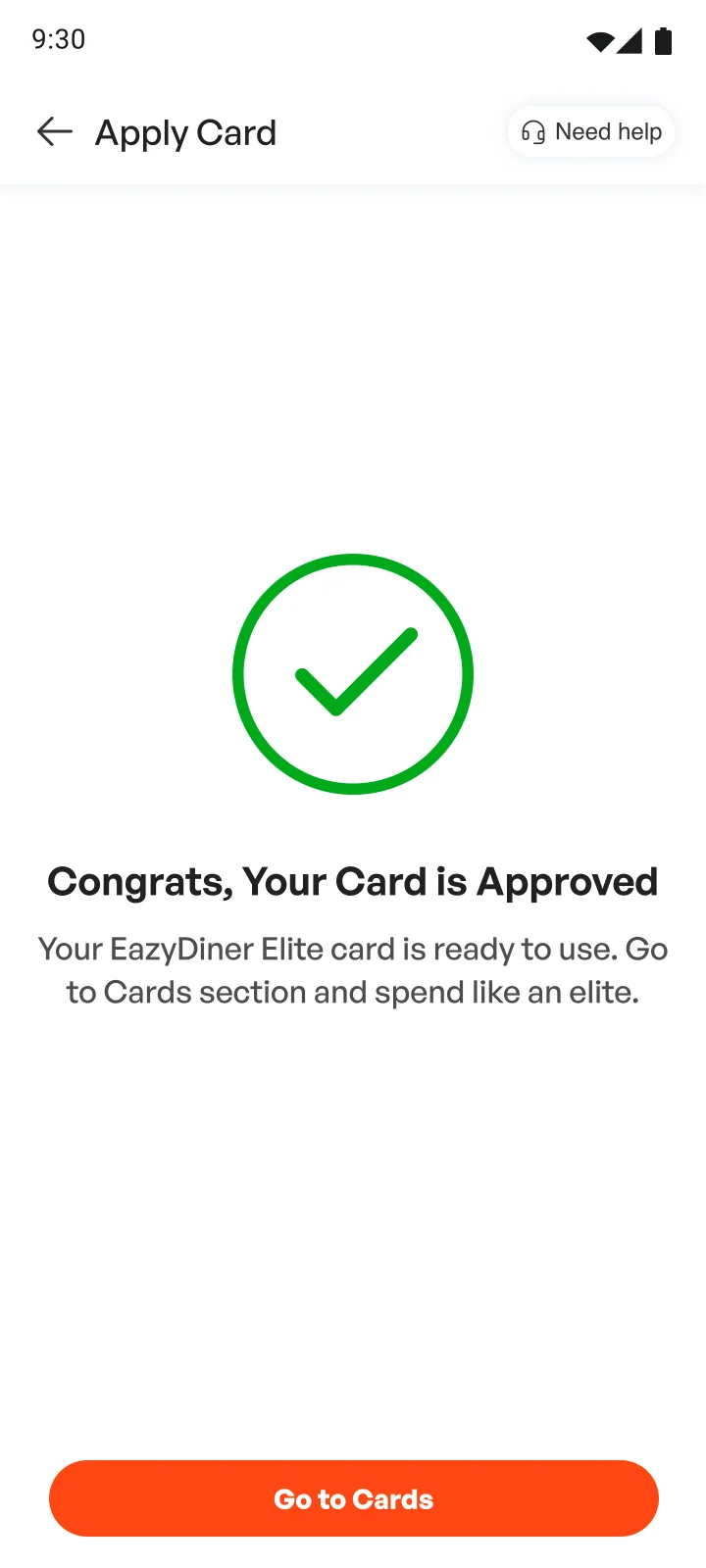
- Each step between approval and first use has its own row with a date.
- The digital card is available straight away.
- The help link is about the application, not a general FAQ.
4 of 4
Card home
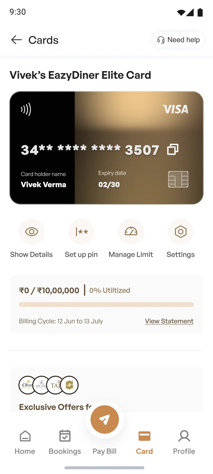
- Total due, due date and Pay now are directly under the card.
- Savings in rupees and in number of meals, for the current billing cycle.
- Freeze replaces Settings in the quick actions; settings moved into card controls.
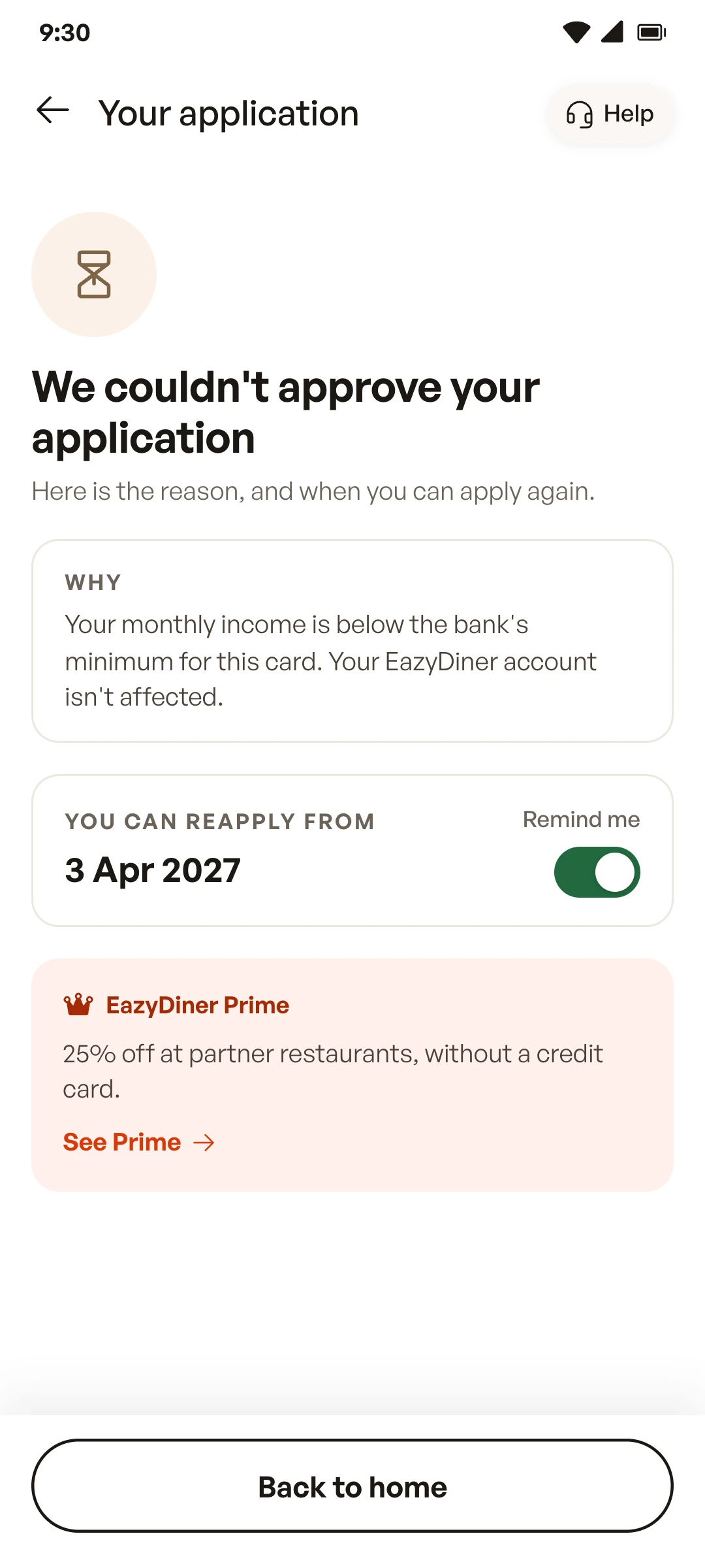
Two new screens
The rejection screen didn’t exist in 2024, and card controls were a list of toggles.
- The reason comes first, in one sentence, with a line saying the EazyDiner account isn’t affected.
- The date you can reapply, with a reminder you can switch on.
- Prime as an alternative: 25% off at partner restaurants, without a credit card.
- Freeze sits at the top of card controls: it pauses all payments until you unfreeze.
- Limits per channel (online, in-store, tap and pay, ATM), domestic and international. Each change is confirmed by SMS.
What I learned
I focused on the application in 2024. Returning in 2026 made me pay more attention to waiting for the card, paying bills and handling rejection.
What I’d test
Filling from the PAN
Whether it raises completion and cuts time on the first step, compared with typing everything.
What I’d test
The savings estimate
Whether it builds trust or feels like being watched. A handful of moderated sessions would show this.
What I’d test
The tracker
Whether it reduces “where is my card?” support requests.
What I’d track
Four numbers
Drop-off at each application step, the share who finish KYC within 24 hours, days from approval to first transaction, and statements paid on time.
Sources
- FICO survey of Indian adultsOutlook Money, August 2024
- RBI Payment System Report, December 2024Business Standard, January 2025
- Visa India on co-branded cardsBusiness Standard, December 2024
- Redseer and Hyperface, co-branded cards, FY24MediaNews4U, August 2024
- NRAI India Food Services Report 2024Millennium Post, July 2024
- Zomato ends its card with RBL BankYourStory, April 2023
- Paisabazaar study of first credit cardsOutlook Money, November 2023
- CRIF High Mark on new cardholders, 2024Outlook India
- ANQ credit card surveyOutlook Business, April 2024
- EazyDiner IndusInd Bank Credit CardIndusInd Bank, read in 2026
- Swiggy HDFC Bank Credit CardSwiggy, read in 2026
- Amazon Pay ICICI Bank credit cardAmazon India, read in 2026
- Amazon Pay ICICI passes a million cardsAmazon, October 2020